5 Amazing Blog Layouts for a Beautiful Blog Design
A blog layout refers to the structure and organization of content on a blog — a webpage that features various types of content, from paragraphs of text to high-quality images or eye catching graphics. Blog content can be about company updates, how-to manuals, personal stories, and more.
From a design perspective, a blog is often optimized for readability and navigation, with features such as categories, tags, archives, and search functionality to help users find content of interest. Additionally, blogs often incorporate images, videos, and animations to make user experience more enjoyable and unique.
In this article, we will go through the most important elements of the blog layout and we will show you a list of best blog designs that you can copy.
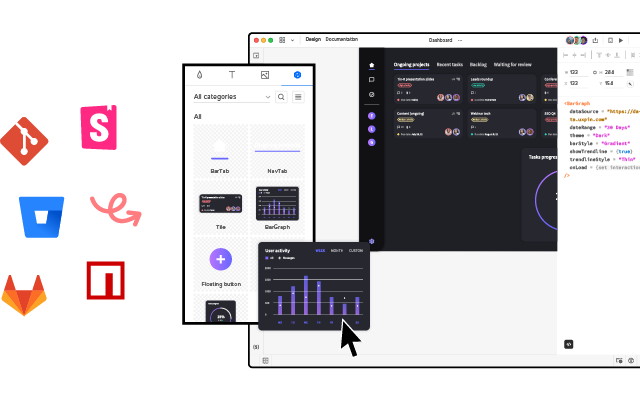
Create a well-optimized and user-friendly blog layout with UXPin Merge – drag-and-drop UI builder that makes web design extremely easy. Choose components, arrange them on the canvas, and then, change their properties to create a unique UI that reflects your brand. Try UXPin Merge for free.
What is a blog?
A blog is a type of website or section of a website that is regularly updated with new content, typically in the form of articles, posts, or entries. These entries are often displayed in reverse chronological order, with the newest content appearing first.
Blogs can cover a wide range of topics and purposes, including personal journals, professional insights, news updates, tutorials, reviews, and more. They often provide a platform for individuals or organizations to share their thoughts, expertise, or experiences with an audience.
Overall, blogs play a significant role in web design as they provide a dynamic and engaging way for creators to connect with their audience and share content online.
What to include in a blog layout?
A blog layout can have various design elements that influence navigation and user experience. Le’s go through some of them.
Header
The header is situated on the top of the page. It usually contains the blog title or logo, along with navigation menu that features links to other pages of the blog, such as blog homepage, about page, contact page, and blog categories.
By appearing at the top of the page, the header provides a consistent visual element throughout the blog. This consistency helps users orient themselves and reinforces the blog’s brand identity across all pages.
Additionally, the header is often the first thing visitors see when they land on the blog. A well-designed header creates a positive first impression, drawing visitors in and encouraging them to explore further.
Blog content area
This is where the blog articles are displayed. Each post typically includes a title, the author’s name, publication date, content (text, images, videos), and social sharing buttons.
A well-designed content area enhances the overall user experience by making it easy for visitors to read and engage with the blog posts. Clear typography, appropriate use of white space, and sufficient contrast between text and background contribute to readability.
Moreover, content areas are important for boosting search engine optimization. Including relevant keywords in the content areas, such as in the body text, subheadings, and meta descriptions, helps search engines understand the topic of the blog post. This increases the likelihood of the blog post appearing in search engine results pages (SERPs) when users search for those keywords.
Search engines prioritize content that provides value to users and is well-organized. Content areas that offer insightful, informative, and well-structured content are more likely to rank higher in search results. Additionally, well-organized content makes it easier for search engine crawlers to index and understand the content, which can positively impact SEO.
Sidebar
The sidebar is located either on the left or right side of the main content area and often contains additional elements such as:
- Search bar — Allows users to search for specific content within the blog.
- Blog categories and tags — Help users navigate and filter content based on topics or themes.
- Recent articles — Lists links to the most recent blog posts.
- Featured articles — Highlights links to the blog’s most popular or trending content.
- Call to action links — Allows users to perform an action that’s desired by the blog owner, such as subscribe to the blog’s RSS feed or email newsletter, located here to maximize conversions.
- Social media links — Links to the blog’s social media profiles for users to follow or share content.
Footer
The footer typically contains links to important pages, such as the privacy policy, terms of service, copyright information, and contact details. It may also include additional navigation links or widgets.
Footers contribute to the overall design consistency of the blog by providing a uniform layout and visual style across all pages. Consistent placement of elements such as navigation links, copyright information, and links to other pages reinforces the blog’s brand identity and professionalism.
5 Examples of blog layouts
We gathered a collection of successful blog designs to show you how to create your own blog design.
Animalz
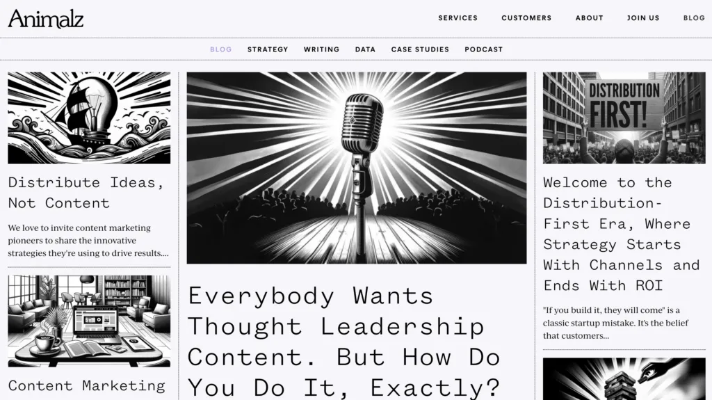
A perfect example of a minimalist design a business blog of content marketing agency — Animalz. With a black and white color scheme, this blog is structured like an online newspaper (matrix web structure). It has a prominent blog post with a featured image at the center of the page, and the rest of the articles are positioned as cards.
You can use MUI components that are built-in UXPin if you want to create a similar blog. Take a menu component and put it on the canvas, then arrange a couple of cards in responsive layout structure.
Zen habits
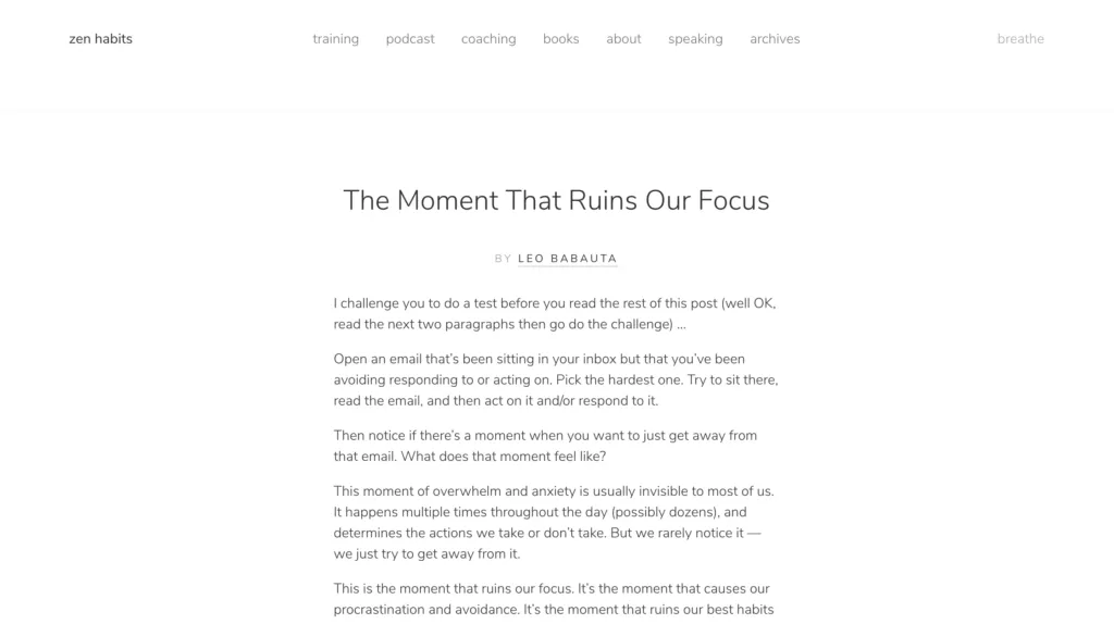
This is a lifestyle blog example that knows well its target audience — individuals interested in personal development, mindfulness, simplicity, productivity, and minimalism. Zen Habits, founded by Leo Babauta, focuses on helping people cultivate habits and lifestyles that promote mindfulness, and overall well-being.
The blog structure reflects those values. With an ample use of white space, elegant typography, and minimalist color scheme, the website design evokes the feelings of serenity, focus, and peace.
Our trial kit contains a similar blog card template that you may use as a landing page of your blog. Like in Zen habits, it features the most recent article. You can quickly add a button with a call to action at the end that makes readers see more articles from the author.
Huberman Lab
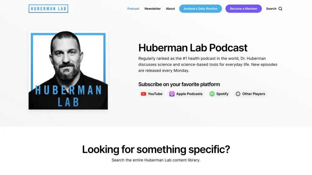
A blog can also feature a list of podcasts and Huberman’s Lab is a great example of that. Andrew Huberman is a neuroscientist and professor at Stanford University who is known for his work on brain plasticity, neuroscience, and optimizing human performance.
Besides its minimalistic color palette, you should note an excellent search option on this blog. It’s very user-friendly and helps you find the right information without scrolling through the entire archive. The blog has also well-thought-out categories to make the target audience focus on the topics they’re interested in.
Travelfloss
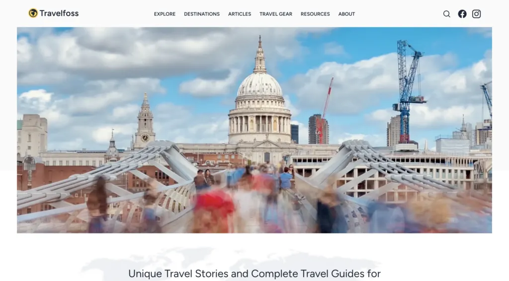
People write travel blogs for various reasons, often driven by personal passion, professional interests, or a combination of both. That’s why we included a well-known travel blog in this article. Travelfloss is a blog with travel tips and gear reviews. It’s a great blog for anyone who wants to learn about real travel experience.
They have a well-made navigation menu that features their social media accounts and a great footer with the best links that make the site easy to consume. Every blog entry has lots of eye-catching photographs that make reading more enjoyable.
What also stands out as a design element are tags that also aid navigation. Travelfloss is easy to replicate if you’re looking for a user-friendly blog template.
Sixteen Ventures
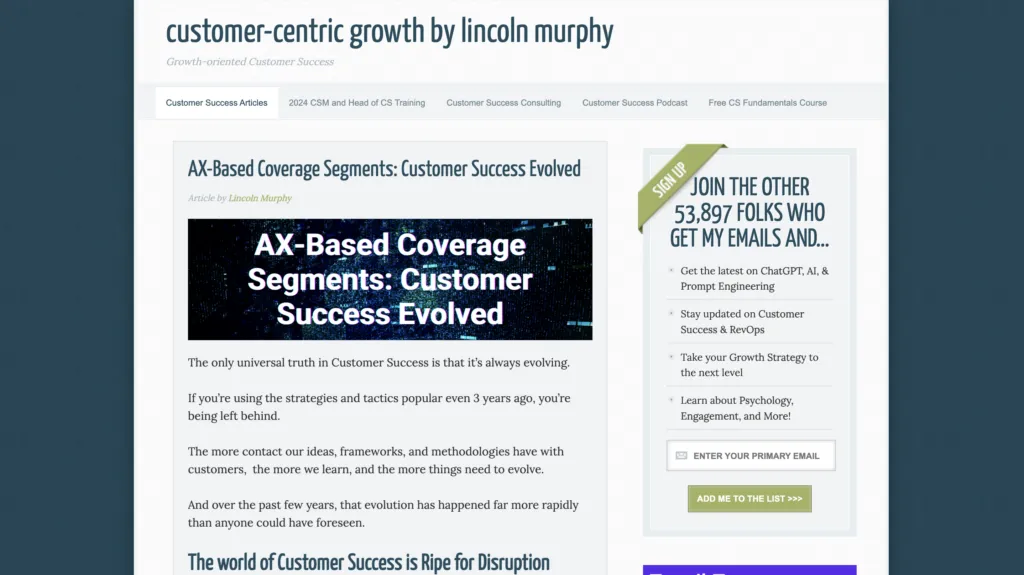
Here’s another example of a business blog. Lincoln Murphy, the author behind Sixteen Ventures is a Customer Success expert who consults the teams wanting to improve their customer experience. At first, his blog looks like any other WordPress theme, but it a well-designed sidebar that we haven’t seen so far.
If you want to advertise other ventures to your audience, a sidebar is a great solution. You can promote your newsletter there, invite people to listen to a podcast or sign up for your course.
Blog layout best practices
Here are seven best practices for blog layout design:
- Clear and intuitive navigation: Make sure that visitors can easily find their way around your blog. Use a clear and intuitive navigation menu that prominently displays categories, tags, and other important sections.
- Mobile responsiveness: With an increasing number of users accessing websites from mobile devices, it’s crucial to ensure that your blog layout is responsive and looks good on smartphones and tablets. Opt for a responsive design that adjusts seamlessly to different screen sizes and orientations.
- Readable typography: Choose a legible font for your blog posts, headings, and navigation elements. Pay attention to font size, line spacing, and contrast to ensure optimal readability, especially on smaller screens. Aim for a font size of at least 16 pixels for body text.
- Visual hierarchy: Use visual cues such as headings, subheadings, bold text, and bullet points to create a clear hierarchy of information. This helps readers scan your content quickly and find the most important points. Employ whitespace generously to enhance readability and create a sense of balance.
- Engaging multimedia content: Incorporate multimedia elements such as images, videos, infographics, and interactive widgets to enhance your blog posts and make them more engaging. Visual content can break up long blocks of text, illustrate concepts, and capture readers’ attention.
- Consistent branding: Maintain a consistent visual identity across your blog, including colors, typography, imagery, and logo placement. Consistent branding helps reinforce your blog’s identity and makes it easier for visitors to recognize and remember your brand.
- Optimized loading speed: Optimize your blog layout for fast loading times to provide a smooth user experience. Minimize unnecessary elements, use efficient coding practices, and optimize images and multimedia files to reduce page load times. A fast-loading blog not only improves user satisfaction but also contributes to better search engine rankings.
By following these best practices, you can create a blog layout that not only looks appealing but also provides a user-friendly experience, encourages engagement, and supports your blogging goals.
Create a blog layout in UXPin
A well-designed blog prioritizes readability and navigation, offering features like categories, tags, and search functionality to guide users seamlessly through the content. By incorporating multimedia elements such as images, videos, and animations, blogs enhance the overall user experience, making it both enjoyable and engaging.
For those looking to streamline the design process, tools like UXPin Merge offer intuitive drag-and-drop functionality, allowing you to create custom UI designs with ease. With the ability to select components, arrange them on the canvas, and customize their properties, UXPin Merge empowers you to bring your vision to life effortlessly.
Begin your journey towards a well-optimized and user-friendly blog layout today with UXPin Merge. Try it for free.
