The products we find most engaging have a basic design pattern: a hook.
In his book, Hooked, Nir Eyal explains how to form hooks: experiences that connect users’ problems to a company’s solution with enough frequency that a habit is formed. Hooks are in all sorts of products we use with little or no conscious thought.
Over time habits are formed as customers form associations sparking unprompted engagement. They move from needing external triggers like advertisements and other calls to action, to letting associations with internal triggers spark unprompted engagement on its own; to self-trigger.
The hard part is getting from the need of external triggers to letting internal triggers and associations do their job. Looking into the patterns of psychology is the key. Many of these are documented in the Persuasive Pattern card deck; a collection of 54 design patterns driven by psychology. Each card describes a psychological insight and explains ways to apply it to your product. Let me explain a few of them.
Below are 6 of such persuasive patterns, which will all help you form hooks that will connect your users’ problems with your company’s solution – hopefully with enough frequency to form a habit.
1. Feedback loops
Communicate how our actions modify subsequent results. Allow people to play interactively with information in so they can adjust their behavior and future actions toward reaching a greater goal. Use numeric data to show progress and translate data into analogous visual information.
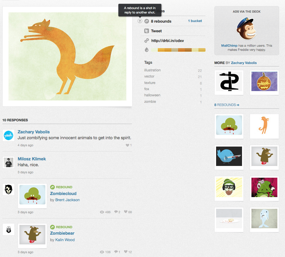
Dribbble.com lets designers upload their own designs to get feedback from their peers, who can then reply with rebound alternate takes on the initial designer’s proposal. In a recurring feedback loop, designs can again be rebounded and so forth. Dribbble play on multiple ways of starting a feedback loop: likes, comments, tweets, and rebounds.
2. Kairos
Communicate to users in situations that are the opportune moments for change. Kairos represent situations of change. Situations of change are potentially valuable as users are here especially open and receptive to change or making a deal.
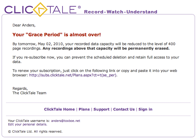
When your trial period nears an end at ClickTale, you are notified that you are about to loose everything you have recorded so far. Act now or lose out on valuable data forever. They’ve identified an opportunity for selling me a paid account at the time of change that was most opportune.
3. Trigger
Use small nudges to cue users to take action – directly or through learned associations. Triggers cue the user to take action in the context they are in. Triggers might be notifications, tweets, emails, text messages, links, or other distractions. Offline triggers should also be considered. Triggers can be set (alarms), brought home (printed reminder sheet), or follow an action (ask someone a question).

Meetup.com has implemented both a notification system and group and private messaging; all great triggers for continued behavior.
4. Tailoring
Adapt the offerings of a system to match individual users’ needs and abilities. Tailored information is more effective in changing attitudes and beliefs than generic information. Make life simpler for users by showing only what is relevant to them. Tailor to factors relevant to the individual such as individual needs, personality, interests, and usage context.
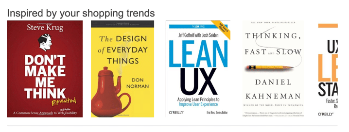
Amazon.com is the classic example of a site that has mastered tailoring to its fingertips. Their data-driven suggestions based on your browsing and purchasing habits are prevalent on both their website and in their newsletters.
5. Self-monitoring
Enable users to track the behavior they want to change. Make it easy for people to know how well they are performing a target behavior, increasing the likelihood that they will continue to produce the behavior. Self-monitoring can help users learn about themselves and can be intrinsically motivating.
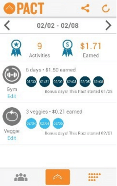
The mobile fitness app “Pact”, lets you commit to a goal of exercising regularly. If you don’t reach the goal, you have to pay up. If you do reach your goal, you are paid by those who didn’t reach theirs. Pact helps you track your exercises to make sure you stick to your goal.
6. Periodic Events
Construct recurring events to build up anticipation, a sense of belonging, comfort, and a sustained interest. Consider ways to create shared recurring experiences users can look forward to or reminisce about. Typical examples of periodic events are seasonal events such as Christmas, Mother’s Day, and Black Friday sales events. However, you can also create your own events. Consider how you can implement things like monthly report cards, weekly tips, and daily updates.
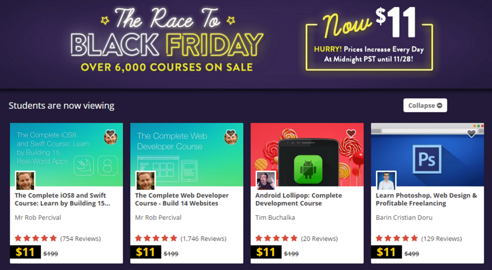
Udemy.com uses Black Friday to sell their courses at a gracious discount.
Next Steps
If you found this post interesting, feel free to check out my Persuasive Pattern cards. The 54 insights are the result of years of writing and teaching about these exact principles.
I created the cards to help generate ideas for new products, features, or creative solutions to problems.
You can also check out the free 2016 Web UI Design Best Practices Ebook Bundle, which includes over 400 pages of advice on web design and UI patterns.

