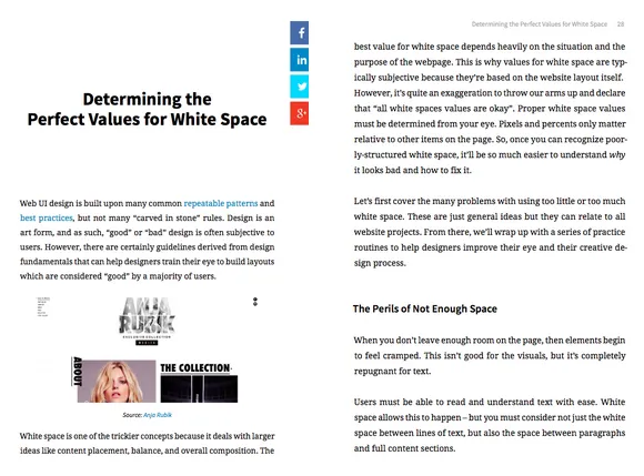
Following the success of our first standalone book on white space, we are expanding our discussion of white space with another new ebook.
Take a look inside the Zen of White Space in UI Design: Space, Ratios, Minimalism.
With the growing popularity of simpler designs, white space is more important now than ever before. Because it’s sometimes hard to think of “nothingness” as its own design element, the free e-book provides expert advice, 14 deconstructed examples, and plenty of practical techniques.
While the first ebook explored white space’s role in balance, contrast, and visual hierarchy, this new book dives deeper into how it applies to spatial relations, aesthetic ratios, and the style of minimalism.
What’s Inside…
This book features a compilation of best practices, explanations, suggestions, and examples covering topics like:
- Why minimalism – and its heavy use of white space – is so successful
- The difference between active and passive white space, and how to apply each
- How to apply the golden ratio to optimize your site’s visuals
- How to strike the perfect balance between too much and too little emptiness
- Which are the best grid generators and typography tools, and where to find them


