Creating a UI style guide requires focused answers to seemingly simple questions.
How big do we make our headers? What hue of blue is our logo? Where’s the reusable code base for new pages?
Website and app building is full of minutiae that even Rainman couldn’t keep track of, and for designers it gives new meaning to the phrase “the devil is in the details.” Thankfully, style guides can keep track of this data for you, so that when you need it, it’s just a few clicks away.
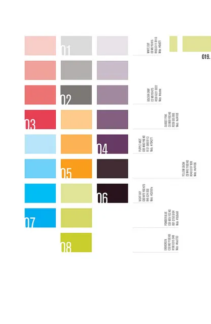
Photo Credit: “Switch.” VFS Digital Design.Creative Commons.
Here we’ll talk a little about style guides: what they are, and how they can help.
What is a Style Guide?
A style guide is a comprehensive “living document” that keeps track of all the repeating elements for a project, from branding rules down to the amount of beveling for call-to-action buttons.
Style guides should also impart rules and suggested practices, including dos and don’ts. On a more holistic level, they’re a great place to define the design philosophy for a company.
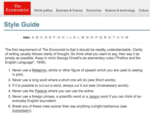
Photo Credit: The Economist
True, style guides require extra work to create — especially at the beginning, when you’re busy enough already. But in the long run, that extra work early saves time later: it makes referencing a lot smoother, and prevents confusion and misunderstanding among teams.
Don’t think of style guides as an academic PDF for onboarding new hires. When used properly, they’re collaborative tools that complement aspects of the design and add the following advantages.
Style Guide Advantages
- Visual consistency – As explained in Web UI Design Best Practices, style guides help you create a cohesive design that reflects a common visual language. Elements like color palettes, typefaces, animations, and navigation menus all contribute towards a unified user experience.
- Context – Great style guides account for explaining the reasoning behind design decisions. For example, in addition to explaining the technical details for pages with scrolling navigation and those with tab navigation, you should also explain that scrolling are used for storytelling, while tabs are used for product displays.
- Collaboration – Having a set reference manual for each member of the team will ensure that everyone’s on the same page. Collaboration is easier, with less repeated questions and back-and-forth emailing.
- Singular vocabulary — Another collaborative trait is streamlining communication through a singular vocabulary (i.e., defining what a “widget” or a “module” might be). Nailing down proper naming conventions can spare a lot of unnecessary miscommunication.
- Code standardization – Front-end style guides help standardize the (X)HTML, CSS, or Javascript, so designers and developers can see if a new design deviates from established standards. They also help you discover if existing markup easily expanded.
- Consolidation – Designers only need to look one place to reference all components, as opposed to losing time sifting through different notes and questioning which documents say what.
- New employee orientation – Rather than repeatedly teaching new hires the standards, you can send them a style guide for reference as they ramp up. With the style guide as an anchoring document, follow-up conversations will be more meaningful.
- Helps with design decisions — Don’t overlook that the process of making the style guide can draw your attention to some crucial design decisions that you may have otherwise forgotten.
Most relevant to web and mobile UI designers, the front-end style guide is what most people think of when they hear the term “style guide.” These are much more detailed than rougher style guides (like mood boards and style tiles).
These robust manuals usually live as a section on a company’s internal or public website, including snippets of code alongside more common guidelines about typography and branding, etc.
Front-end style guides are useful because they help connect design with development. Just iterate and include any reusable code and UI patterns.
If this is your first encounter with style guides, it helps to take a look at some effective examples to see how it’s done. Below are five examples from some recognizable brands.
5 Examples of Style Guides Done Right
1. BBC GEL
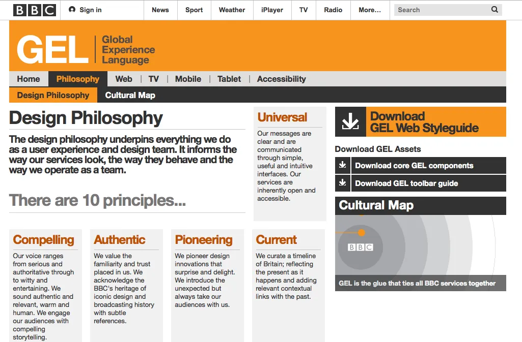
Photo Credit: BBC GEL
While currently being updated, the BBC GEL style guide lists more than just technical details. Their design philosophies are outlined in the beginning to create the proper context for the described tactics. Each platform section even contains subsections for discussing a more specific philosophy, technical details, and downloadable assets for that platform.
2. Yelp

Photo Credit: Yelp
Of course, style guides can also be purely technical reference guides. Yelp’s style guide, for example, systematically lists out black-and-white details with the corresponding HTML coding.
Their style guide is a good example to follow for teams on a time crunch – they outline all the relevant information they need, whether typographical to stylistic, and accompany each with the proper coding. To ensure proper implementation, always address developer needs in your style guide. .
3. Ubuntu
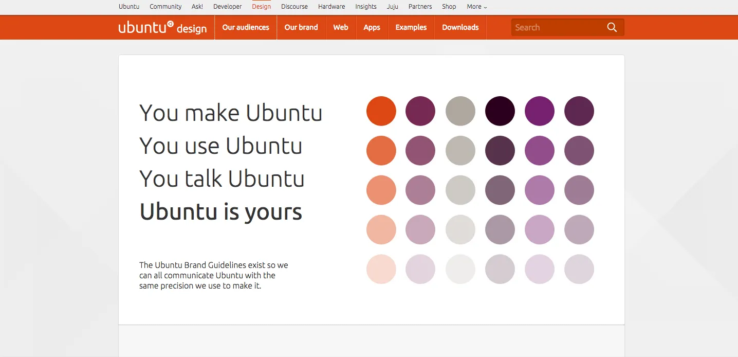
Photo Credit: Ubuntu
The style guide for Ubuntu includes everything from a slider that determines tone based on audience, to reusable sections of Javascript code. It also divides itself into several smaller guides — for the brand, web, apps, etc. — a structural choice that improves searchability.
4. Atlassian Design
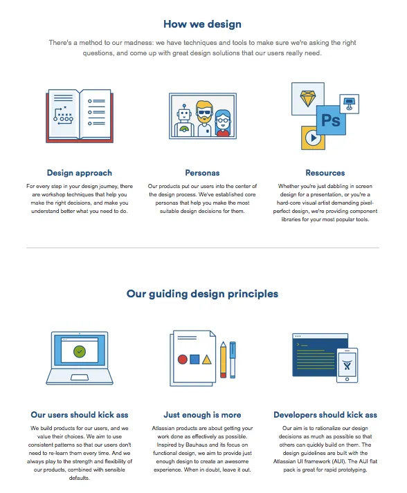
Photo Credit: Atlassian Design
The Atlassian Design style guide is beautifully organized while still functional. Aside from technical details for product design, user interface, and branding, they provide extra information such as their step-by-step approach to design, core personas, and additional resources for visual design. As if that weren’t enough, they also include basic descriptions of their design principles to give their style guide a philosophical edge.
5. Lonely Planet
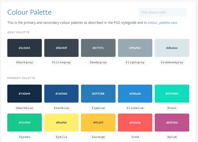
Photo Credit: Lonely Planet
Like Yelp, the style guide for Lonely Planet sticks just to the facts. Their section on color above leaves no room for error, with coding-specific hues. Each page of their elaborate style guide is equally detailed, including several pages listing out all of their icons.
Takeaways For Creating UI Style Guides
At heart, style guides are design and development aids meant to make the lives of you and your team easier. With that in mind, don’t do more work than necessary. Browsing through example style guides, it’s normal to feel overwhelmed by the wealth of detail some companies include.
But you don’t need to include everything, especially if you’re a smaller company. Ask around with your team, so you know what’s helpful and what’s unnecessary — shorter style guides make it easier to find what you’re looking for.
This article is just an overview, but we dive into the more practical tips and analysis for creating style guides in our free e-book, the Critical Components of Web UI Style Guides. Learn from examples from 22 companies such as Yelp, Starbucks, Facebook and Mailchimp.


