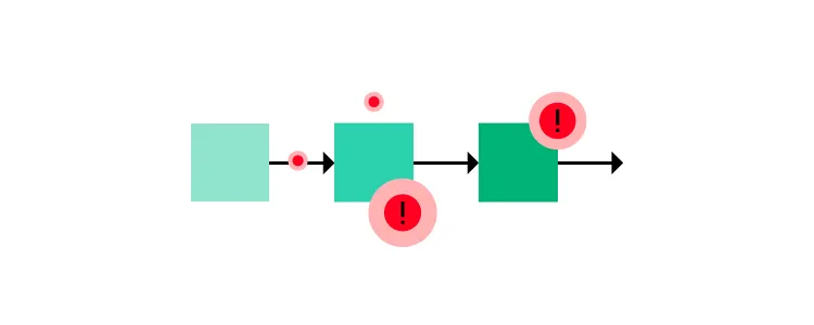
What is Happy Path in UX Design?
Designing happy paths is every designer’s priority. Happy paths create positive user experiences, increasing product adoption and retention.
Key takeaways:
- Happy path is optimized series of steps that a user takes to complete their goal.
- The opposite to a happy path are edge cases and error states.
- To design a perfect happy path use clear visual cues, contextual helpers, simplify your design, provide feedback and test your prototype before handing it over to engineers.
Design digital product experiences users love with UXPin, an advanced prototyping tool. Sign up for a free trial.
What is a Happy Path in UX Design?
A happy path in software development describes a frictionless, error-free user flow. The user completes their task as intended without problems resulting in a “happy user experience.” The intent is not to make users feel happy. Instead, designers must create an efficient, intuitive user flow that meets the user’s expectations.
For example, a first-time user wants to create an account for a new mobile app.
- The user opens the app and is immediately presented with a signup screen.
- The user can enter their name and email address or use a social login for faster onboarding.
- They enter their name and email and click a large signup button.
- The user immediately receives an email to verify their account.
- They open the email and click the verification link, redirecting them to the application where they can begin using the product.
There are actually two happy paths in this example. The user could use a social login, ending the process at step two. Both use cases provide a smooth, frictionless user experience where users can signup.
Another name for a happy path is happy flow.
Why is a happy path important?
Happy paths are crucial for digital product design because they create positive user experiences. Products that serve users by delivering what they need with optimal efficiency increase usage, engagement, and retention.
So, what is a golden path, then?
A golden path is a term coined by Spotify to describe the optimal workflow and environment for backend engineers. Organizations have copied this concept with their own variations, notably Paved Road (Netflix) and Silver Path. These concepts are not related to UX or happy path.
Edge Cases and Error states – The Opposite of Happy Paths

You’d expect the opposite of a happy path to be a sad path, a bad path, or an unhappy path–but these are not terms design teams use. Instead, designers use edge cases and error states to describe problematic user flows.
Edge cases
Edge cases are scenarios outside of the expected behavior of users or technology. These anomalies are often tricky to solve during the design process as designers don’t think to expect them.
For example, a digital product’s iOS app may render an animation differently from the Android and Web versions, creating an unexpected usability issue.
When Apple released its new M1 chips in 2021, the laptops were incompatible with many apps and services. Developers had to release patches or compatible versions to accommodate Apple’s new chips.
Other edge cases include:
- A specific screen reader unable to navigate a user interface
- Slow internet connections
- The combination of a browser, device, and application causes a digital product to crash
Error states
Error states prevent users from completing a specific task due to a system failure, incorrect user input/action, or other issues. Unlike edge cases, designers can usually anticipate error states and provide users with steps to fix the problem.
A typical example of an error state is the red error messages on form fields. If the user doesn’t complete the field correctly, an error message appears to help them–i.e., “Password must be at least 8 characters long.”
10 Best Practices for Creating Happy Paths

Design simple user interfaces
Design simplicity is the key to creating happy paths and positive user experiences. Designers provide users only the UI elements and features needed to make decisions and complete tasks.
Use clear visual cues
Visual cues like arrows, icons, color, typography, visual hierarchy, and other UI elements guide users, making it obvious what to do next. When users don’t have to overthink their actions, they move through user flows efficiently to complete tasks.
Offer shortcuts and offramps
Shortcuts allow users to complete tasks as quickly as possible. These shortcuts allow people to skip less important steps in a user flow or pre-filling forms with data from someone’s account. For example, allowing users to save delivery or credit card details means they don’t need to enter them for future purchases.
Offramps make it easy for users to back out or save a task to complete later. For example, include a back button to a user flow or a “save for later” option.
Helpful error messages
Designers must test error states to ensure messages help users fix issues. Error messages must provide clear instructions for resolving a problem so users can continue on the happy path as quickly as possible.
Contextual helpers
Tooltips, popups, and other contextual helpers streamline onboarding while educating users about elements and features. Contextual help enables users to solve problems without referencing documentation or contacting support.
Progress indicators
Progress indicators manage expectations by telling users where they are and what they still need to do to complete a task. This feedback keeps users engaged and motivated as they move through your happy path.
Personalization
Personalization is an excellent way to keep users engaged and provide a happy user experience. For example, apps like YouTube, Instagram, and TikTok use personalization in algorithms to suggest content based on viewing history.
Make it easy to ask for help
Many organizations intentionally make customer support difficult to access–adding to the frustration of being stuck. Providing help when people need it is crucial for creating happy paths to completing tasks. Apps like Intercom and Zendesk provide users instant access to FAQs, documentation, and customer support to solve problems in-task.
Feedback and microinteractions
Microinteractions provide feedback to confirm user actions and display status. For example, if you click a button to submit a form, a spinning loading icon tells the user the system is processing their action. These helpful microinteractions give users confidence the app is working correctly while navigating them through tasks and problems efficiently.
Test, test, and test again
Lastly, the best method for designing happy paths is engaging with users through testing. User testing confirms that your happy paths solve user needs while identifying better ways to create UIs.
When UX designer Kai Wong and his team tested their prototype with a visually impaired user, they discovered that the screen reader confirmed the user’s social security number out loud–meaning anyone nearby would hear it. This test revealed that the team’s happy path created a security vulnerability for screen readers–not a happy path for some!
Happy Path Testing With UXPin
Design tools often don’t provide a happy path for designers during user testing. These image-based tools lack the fidelity and functionality to test user flows and interactions effectively.
With UXPin, designers can create exact replicas of digital product experiences with code-like fidelity and interactivity. These fully interactive prototypes enable teams to conduct high-quality tests, identify more usability issues, and get meaningful feedback to optimize happy paths during the design process.
Advanced prototyping features
- States: Create multiple state variants, each with different properties and interactions for a single component.
- Variables: Capture user input data and use it to create personalized, dynamic user experiences.
- Expressions: Javascript-like functions to create complex components and advanced functionality–like password validation for forms or a fully functioning checkout flow.
- Conditional Interactions: set conditions to create multiple dynamic, happy path scenarios based on user interactions, accurately replicating the final product experience.
Interactive prototyping
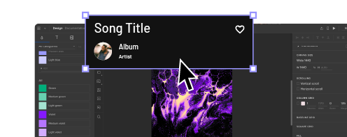
These features enable designers to design prototypes with code-like functionality and fidelity. UXPin’s Calming App is an example of these four features in action with smooth transitions, animations, and microinteractions, providing an immersive, intuitive user experience.
The “Relax” feature includes real audio clips embedded in the prototype–impossible to create using traditional image-based design tools. Designers also have access to real data and APIs to develop prototypes indistinguishable from the final product with just a few clicks.
Software testing error states
These advanced features allow designers to test error states with helper text, alerts, snackbars, and other UI elements. The example below demonstrates how designers can combine UXPin’s States, Variables, Expressions, and Conditional Interactions to display form field error messages for many possible scenarios.
Better stakeholder feedback and smoother design handoffs
Interactive prototypes don’t only benefit users with exceptional experiences; they also receive better feedback from stakeholders. Designers don’t have to explain designs to stakeholders because UXPin’s prototypes function like the final product.
Design handoffs are smoother, with less friction, because UXPin prototypes require less interpretation and documentation. Engineers can use UXPin’s Spec Mode to inspect properties, measure distances, copy starter CSS, and view the product’s style guide–everything required for development in one place.
Solve more problems and design immersive happy paths with UXPin’s advanced prototyping features. Sign up for a free trial.


