How to Design Better Progress Trackers and Control User Expectations

Progress trackers are one of the many ways designers communicate with users. These UI design patterns provide context, track progress, improve usability, and, in some cases, motivate users to complete forms and tasks.
Designing progress trackers requires a comprehensive understanding of the process and empathizing with users–how are they feeling while completing this task, and what can a progress tracker do to alleviate any frustration and anxiety?
Create fully interactive progress tracker prototypes that look and function like the final product. Sign up for a free trial to discover how UXPin can enhance prototyping and testing to create better user experiences for your customers.
What is a Progress Tracker?
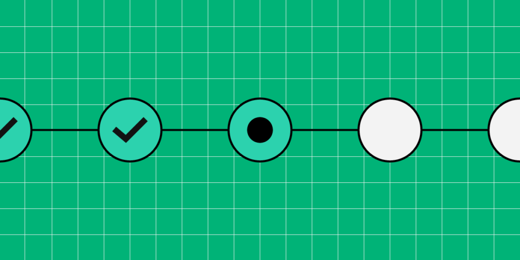
Progress trackers are UX patterns displaying the number of steps, the user’s current status, and overall progress in completing a task. These progress trackers are particularly useful for completing long forms with multiple stages, like eCommerce checkouts, insurance/medical onboarding, visa/passport applications, and other instances where organizations require lots of data.
Breaking forms into manageable chunks reduces cognitive load, which ultimately increases conversions. These steps also allow users to save their progress and return to complete the form later.
Progress trackers vs. Progress indicators
Progress trackers are step-by-step guides showing users where they are and where they’re going, while progress indicators are animated UI patterns used to indicate a system is loading or processing a request.
This example from Material Design shows the two types of progress indicators designers use, linear and circular.
A progress tracker, on the other hand, communicates a step-by-step process–as seen in this example from Ben Mettler.
Why are Progress Trackers Important?
According to IBM’s Carbon Design System, progress trackers increase task completion. “Use progress indicators to keep the user on track when completing a specific task. By dividing the end goal into smaller sub-tasks, it increases the percentage of completeness as each task is completed.”
Progress trackers are a way to manage a user’s expectations. It shows that you respect their time by being transparent and helpful, which builds trust in the product and brand.
For example, if you have to complete a 10-page form and only get one page at a time, you’ll have no idea how long it’ll take to complete. You might not have the time or required documentation (payment details, ID, vehicle information, etc.) to complete the form. You become frustrated and lose trust whenever the facilitator hands you another page without feedback.
Suppose the facilitator instead gave you the 10-page stack upfront, highlighting each stage with a descriptive title, and informed you of your progress as you completed each step. In that case, you’d have more trust in the process–which is what progress trackers do for digital products.
A good progress tracker shows the user what steps they must complete, including descriptive labels, i.e.:
- Cart
- Delivery address
- Payment details
- Confirmation
This simple eCommerce example displays each step and informs users what information they’ll need to complete the checkout process. Users can prepare the information required to complete the checkout efficiently.
When do Designers use Progress Trackers?
There are two primary instances where designers use progress trackers:
- Progress
- Status
They indicate progress
As described above, forms and processes are the most common UIs where designers use progress trackers. They improve the user experience and are vital UI elements for accessibility, as per WAI UX design guidance: “define visual and non-visual instructions to communicate the total number of steps and the current step in multi-step forms and processes.”
They show status
Status trackers communicate progress from an organization, so users don’t have to contact support for updates. We also see status trackers in products like productivity apps and project management software informing users of progress towards goals.
Typical status tracker examples include shipping trackers, user application processing, eCommerce orders, error handling, food delivery, and task updates, to name a few.
6 Progress Tracker Design Tips
1. Create clear visual cues
Whether you’re designing a progress or status tracker, your design pattern must be explicit, informing the user where they are, what they have completed, and the steps to completion.
A common method is to use color, like this example from Alexander Mochalov via Dribbble.
Alexander uses color and a progress bar with an arrow showing users exactly where they are in the checkout process. A checkmark tells users they have completed the previous step successfully.
2. Use descriptive labeling
Displaying the steps in a multi-stage process is not enough, especially when you have more than three steps. While there are exceptions, designers must use descriptive labels to communicate with users and provide context.
This progress tracker example from Arvind Sathe via Pinterest is visually appealing but doesn’t provide enough feedback about the process.
Conversely, Will Flourance’s example uses explicit labeling to inform users of each stage of the delivery process, including the expected delivery date.
3. Separate progress trackers from similar UI patterns
Breadcrumbs and header navigation can clash with progress trackers causing cognitive overload and confusion. Breadcrumbs and progress trackers are particularly confusing because they look similar visually.
This example from Gamestation via a Smashing Magazine article shows a progress tracker below a breadcrumb. Designers have used distinctly different UI patterns to differentiate the two.
Instead of using a breadcrumb, Gamestation could provide a “Back” button to return to the previous screen. This button would eliminate confusion while allowing users to stop the transaction if they wanted.
Eliminating distracting UI elements, especially navigational items, helps users focus on completing the task.
3. Provide offramps
Many products and eCommerce checkouts lock users into a process with no offramps. They remove all navigation, so the user’s only option is to complete the process.
Forcing people to complete a process creates a negative user experience and erodes trust in the brand. Designers must offer users offramps, like a Back button (as described above), to exit the process or “Save Progress” functionality to return later.
4. Apply logical progression
Progress trackers must use logical progression towards the final goal. Most languages read from left to right, so it’s logical for designers to create a relevant left-to-right progress sequence. However, some languages read right to left, meaning designers must adjust UIs.
For example, Arabic, Hebrew, Kurdish, and Persian are right-to-left languages. Designers must adjust the logical progression to accommodate these user groups.
5. Use microinteractions to guide users
Microinteractions are trigger/feedback loops that communicate with users. Designers can use these microinteractions at the end of each step by animating the progress bar, showing movement towards an end goal.
Microinteractions are also helpful for highlighting errors and showing users where they went wrong. A typical example is a jiggle animation on a form field the user hasn’t completed correctly or left empty.
6. Create responsive progress tracker experiences
Designers must consider the progress tracker user experience across multiple viewports. For example, a horizontal progress tracker might not fit on a mobile device, so using a vertical pattern might be a better option.
This example mockup from Nick Babich shows a vertical progress tracker pattern for a mobile app.
Designing Progress Trackers in UXPin
UXPin’s advanced features empower designers to create prototypes comparable to the final product. These fully functioning, high-fidelity prototypes improve testing to eliminate usability issues for a better overall user experience.
UX designers can use these four interface design features from UXPin to build better progress trackers and other UI patterns.
Interactions
Interactions are critical for building interactive prototypes. UXPin Interactions offer many desktop and mobile triggers so designers can create interactive experiences with smooth, realistic animations relevant to the user’s device.
Conditional Interactions take interactivity to another level where designers can set “if-then” and “if-else” conditions to create immersive, dynamic user experiences, giving prototypes a code-like quality.
States
UXPin States allow designers to create multiple states for a single UI element that change with user interactions. For example, a single button can have several states, like default, hover, active, disabled, clicked, etc.
Designers can use UXPin States to create interactive progress trackers that mimic code-like functionality, like animating the progress bar or changing an icon from a number to a checkmark.
Variables
One of the biggest challenges with prototyping progress trackers and forms is that inputs don’t function in design tools as they do with code–limiting what designers can test accurately during the design process. In UXPin, text fields are fully functional and interactive.
With Variables, designers can capture data from user inputs and use it elsewhere in the prototype. For example, capturing a user’s personal and payment information in a multi-step form and displaying it on the confirmation screen.
Expressions
Expressions allow users to replicate code functionality, like updating a shopping cart or checking if a password meets specific criteria (i.e., character length, numbers, and symbols).
When building an eCommerce user flow, designers can use Expressions to calculate a customer’s cart and then dynamically adjust the total once the customer chooses a shipping option, accurately replicating a code-like experience.
To explore these advanced features and many more, sign up for a free trial to discover how UXPin can enhance your prototyping and deliver exceptional user experiences to your customers.


