UI Grids – All You Need to Know
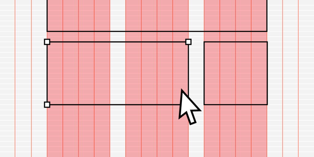
UI grid systems are essential for responsive design, ensuring layouts adapt seamlessly to various screen sizes and resolutions. Designers use grid systems to create fluid layouts that maintain consistency and visual hierarchy, providing an optimal user experience across multiple devices such as desktops, tablets, and mobile phones.
Designers can create three UI grid types, including column, baseline, and square, in UXPin with a click of a button. Sign up for a free trial to explore UXPin’s advanced UX design features.
What is a UI Grid?
A UI grid is a foundational layout structure in design that organizes content into rows and columns, providing a systematic framework for arranging UI elements on a page or screen.
UI grids establish a consistent and harmonious visual order, making navigating and comprehending content easier. By implementing a grid system, designers can create a cohesive and balanced layout that enhances the user experience while ensuring adaptability and flexibility across various devices and screen sizes.
Types of UI Grids
Manuscript grid
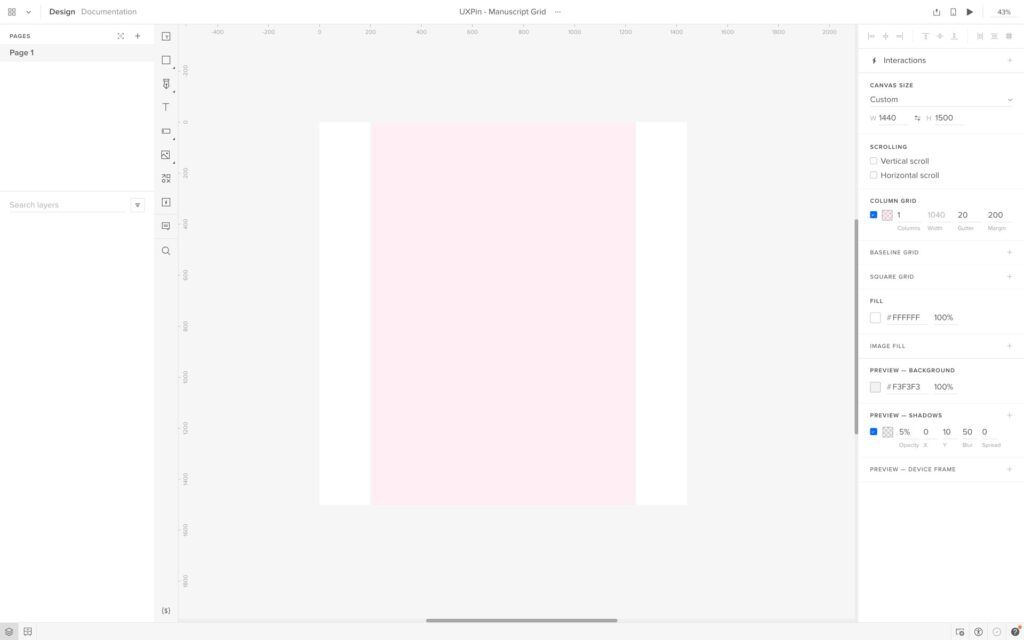
A manuscript grid (single-column grid) is the simplest grid type, consisting of a single column that spans the entire width of a layout. Designers primarily use manuscript grids for long-form textual content, such as blog posts or articles, where readability is a priority.
For example, an online newspaper might use a manuscript grid to display its articles in an easy-to-read format.
Column grid
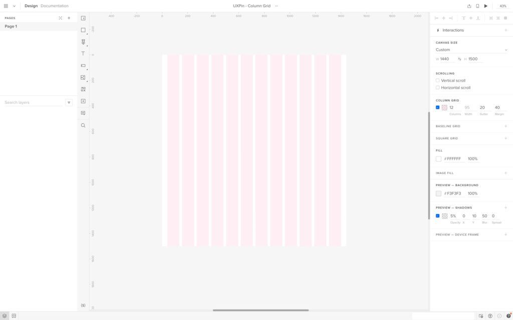
A column grid divides the layout into multiple vertical columns, providing a flexible structure for organizing content. Designers often use column grids for complex layouts, like web pages or app interfaces.
For example, most websites use a column grid system with a 12-column grid for desktop, down to 2-4 column grids for smaller aspect ratios.
Modular grid
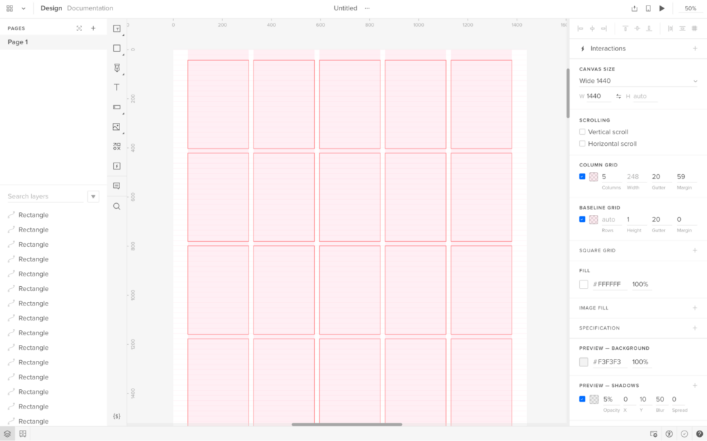
A modular grid is a versatile structure that divides the layout into rows and columns, creating a matrix of equally sized modules. Designers use modular grids for organizing content that requires a high level of consistency and uniformity, such as image galleries, product listings, or card-based UIs.
An example of using a modular grid is an eCommerce site that displays products in a consistent grid format, making it easy for users to browse and compare items.
Hierarchical grid
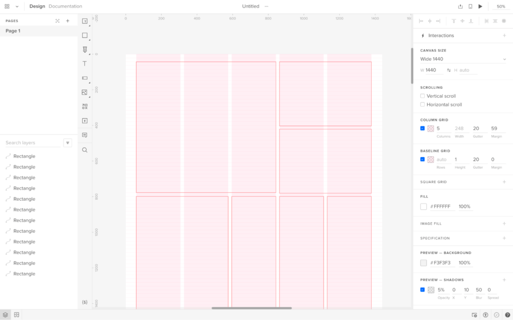
A hierarchical grid is a flexible structure that allows for varying alignments and organization based on the visual hierarchy of the content. This grid type is especially useful when working with content that has varying levels of importance or complexity.
An example of a hierarchical grid is a portfolio website, where designers can emphasize particular projects or elements by varying the size and positioning of the content within the grid.
Baseline grid
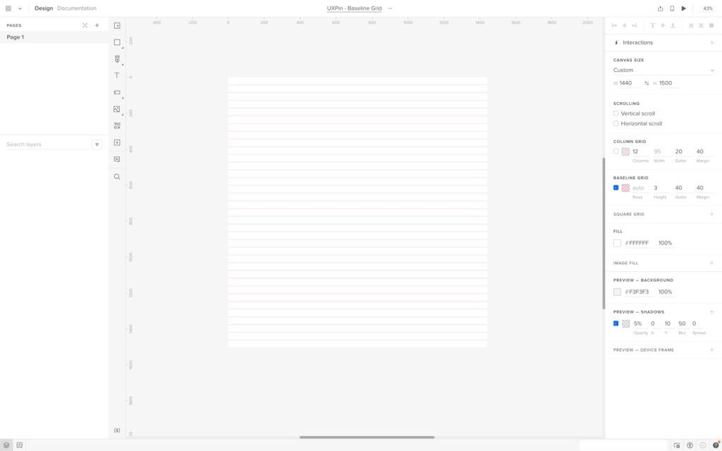
A baseline grid is a horizontal grid structure that ensures consistent vertical alignment of text and other elements across a layout. Designers use baseline grids in typography-heavy designs to maintain readability and visual harmony.
An example of when to use a baseline grid is on a content-rich website or digital publication, where maintaining consistent text alignment across different sections and pages is essential for a professional appearance and improved user experience.
Square grid
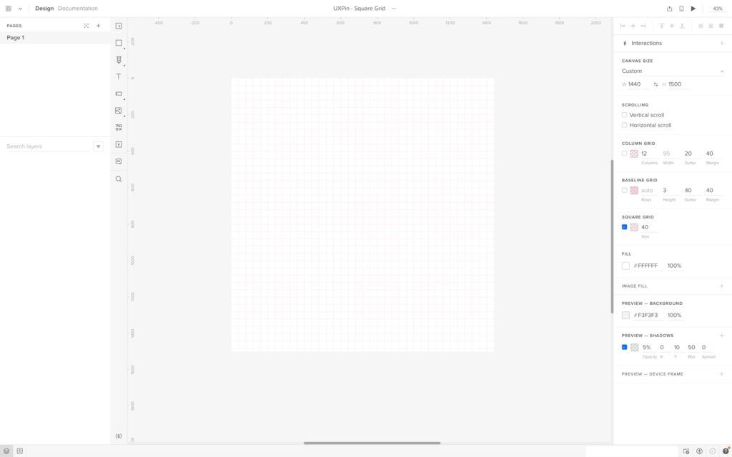
A square grid (grid of squares or a checkerboard grid) is a modular grid consisting of evenly spaced, equal-sized square modules. Designers use square grids to create a visually balanced layout, particularly with square-shaped content like images or icons.
An example of applying a square grid is in a portfolio website, where project thumbnails are arranged in a uniform grid layout, creating a visually appealing presentation and making it easy for users to browse and explore the showcased work.
Understanding Fluid Grids
Fluid grids are a modern UI design approach that facilitates flexible, responsive layouts that automatically adjust to various screen sizes and devices. Front-end devs achieve this fluidity using relative units like percentages instead of fixed units like pixels.
Fluid grids create a dynamic layout that resizes and adapts to the user’s viewport, ensuring an optimal experience across different devices and orientations. Developers implement fluid grids using CSS and breakpoints, which define specific viewport widths at which the layout should adjust or reflow.
Anatomy of a UI Grid
- Columns: Vertical divisions of the grid, providing a structure for organizing content within the layout. They help create balance, hierarchy, and consistency across different sections of a design.
- Gutters (alleys): The space between columns providing breathing room and separation for content within the grid. Gutters help improve readability and create a sense of order within the layout.
- Margins: The space around the outer edges of the grid separating the design elements from the edge of the canvas or screen. Margins help frame the content and maintain consistency across various screen sizes and devices.
- Rows: Horizontal divisions within the grid, often used in conjunction with columns to create a complete grid structure. Rows help establish the vertical flow of content and maintain consistent spacing between elements.
- Modules: Individual units formed by the intersection of rows and columns in a modular grid. Modules provide a flexible and adaptable framework for organizing various types of content, such as text, images, and other design elements.
Advantages of Using a Grid System
- Consistency: UI grids promote uniformity across different sections and pages of a design, resulting in a cohesive, polished appearance that reinforces brand identity and enhances user experience.
- Visual hierarchy: Grid systems help designers establish a clear hierarchy of content by guiding the placement and sizing of design elements, making it easier for users to comprehend and navigate the information presented.
- Scalability and adaptability: Grids enable designs to easily adapt to various screen sizes and devices, ensuring a consistent and responsive user experience across multiple platforms.
- Improved readability: Grid systems enhance readability and make it easier for users to scan by providing structured alignment and spacing for content, making it easier to digest.
- Facilitates collaboration: A shared grid framework simplifies the design process for teams, allowing multiple designers to work together cohesively and maintain consistency across different aspects of a project.
How to Create and Use UI Grids
Determine the purpose and content structure
Begin by defining the purpose of your design and the content structure you’ll be working with. This step allows you to understand the layout requirements and helps inform the type of grid and the number of columns (or rows) that will be most effective for organizing and presenting the content.
Choose the appropriate grid type
Select the grid type that best suits your design needs based on the purpose and content structure. Consider complexity, layout flexibility, and hierarchy when choosing the grid type.
Establish margins and gutters
Define the margins and gutters to provide consistent spacing between elements and maintain a balanced layout. Margins give space around the layout’s edges, while gutters ensure consistent separation between columns and rows. Properly established margins and gutters contribute to a clean and organized appearance.
Define column and row sizes
Determine the size of columns and rows based on the content you plan to display and your desired flexibility. Consistent column and row sizes help maintain a uniform aesthetic.
Align elements and text
Align design elements and text within the grid structure, following the established columns, rows, margins, and gutters. Proper alignment ensures a cohesive appearance and enhances readability by creating a clear visual hierarchy.
Break the grid for emphasis and variety
While adhering to the grid is essential for consistency, occasionally breaking the grid can add emphasis and visual interest to your design. Breaking the grid for specific elements or sections can draw attention to critical content or create a dynamic, engaging user experience.
Best Practices for Using Grids in Design
- Keep it simple and consistent: Use a column grid to create a clean, organized layout for a blog, ensuring uniform text and image alignment across all pages.
- Make it flexible and adaptable: For example, design a responsive website using a modular grid, allowing for smooth adaptation across various screen sizes and devices while maintaining a cohesive visual experience.
- Use whitespace effectively: In a portfolio website, use generous margins and gutters to create ample whitespace around each project, allowing the user to focus on individual pieces without distraction.
- Maintain visual balance: For an online magazine, balance text and images within a hierarchical grid, ensuring that the visual weight is distributed evenly across the layout for a balanced aesthetic.
- Break the grid deliberately and purposefully: For example, on a landing page for a new product, break the grid by placing a large, eye-catching image or call-to-action element outside the grid boundaries to emphasize something fresh and different.
Using UXPin to Streamline Grid Systems
UXPin offers three types of UI grid systems:
We also have a Smart Grid that lets you quickly arrange and adjust the spacing between elements in grid layouts.
Once you’ve set up a desired grid system, UXPin will help with positioning and arrangement by snapping to grid edges–you can disable snapping in settings.
Depending on the grid type, you can adjust various grid properties, including columns, column width, rows, gutters, margin, and offset. UXPin will “remember” any grid settings you choose and apply them to any new pages within a prototype.
Take your prototyping to the next level with UXPin’s UI grids and many other advanced features. Sign up for a free trial to create your first interactive prototype with UXPin.


