Alignment in Design – Making Text and Visuals More Appealing

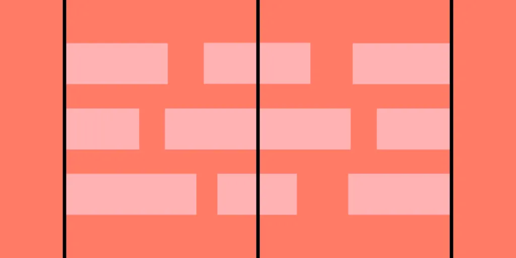
Alignment in design is the strategic arrangement of elements relative to one another or a common baseline, creating order, harmony, and visual appeal. Designers can apply different types of alignment to various design aspects, such as typography, grid systems, and graphic elements.
This alignment is crucial for guiding the user’s eye through content, enhancing readability, and reinforcing the overall design hierarchy. Mastering alignment helps designers craft user experiences that are visually pleasing, functionally efficient, and easy to navigate.
Create visually-appealing user interfaces effortlessly with UXPin’s sophisticated UX design toolkit. Design your first interactive prototype in UXPin right here, right now. Sign up for a free trial.
What is Alignment in Design?
Alignment in design refers to the arrangement of elements relative to one another or a common baseline, creating a sense of order, harmony, and visual appeal.
It involves intentionally positioning text, images, and other elements within a layout to achieve a structured, cohesive, and easily navigable interface. Effective alignment is crucial in guiding the user’s eye through content, enhancing readability, and reinforcing the overall design hierarchy.
The importance of alignment for user experience
Mastering alignment is essential in crafting user experiences that are visually pleasing and functionally efficient. When elements are well-aligned, it helps users quickly understand the interface’s structure, reducing cognitive load and enabling them to complete tasks efficiently.
Consistent alignment across different pages or screens fosters a sense of familiarity and predictability, contributing to improved user satisfaction, engagement, and retention. Alignment is a vital design principle that UX professionals should prioritize to create intuitive and accessible digital products.
Different Types of Alignment
Effective alignment is crucial for creating cohesive and user-friendly interfaces. UX professionals can apply various types of alignment to improve an interface’s visual hierarchy and clarity.
Horizontal Alignment
Horizontal alignment refers to the arrangement of elements along the horizontal axis (left/right). It helps to create a sense of balance and order within a layout.

- Left alignment: Elements are aligned along the left edge, creating a consistent starting point for the user’s eye.

- Center alignment: Elements are centered along the horizontal axis, often used for symmetrical layouts or emphasizing a particular element.

- Right alignment: Elements are aligned along the right side, often used for secondary content or in right-to-left languages.
Vertical Alignment
Vertical alignment deals with the positioning of elements along §§§§§§§§§§§§§§the vertical axis (top/bottom). It enhances the layout’s structure and guides the user’s eye vertically through the content.

- Top alignment: Elements are aligned along the top of the page, creating a unified starting point for the user’s gaze.

- Middle alignment: Elements are centered along the vertical axis, often used for equal emphasis or in grid-based layouts.

- Bottom alignment: Elements are aligned along the bottom edge, typically used for secondary content or footer elements.
Edge alignment
Edge alignment refers to aligning design elements along a common horizontal or vertical edge. This technique establishes a clear visual hierarchy, enhances consistency, and improves the overall layout aesthetics.
Edge alignment can be applied to text and design elements, providing a sense of order and balance within the interface.
Alignment in Typography
The above refers to design or canvas alignment, but we also have typography or text alignment for content. Typography plays a significant role in creating visually appealing and legible user interfaces. Proper alignment in typography enhances readability and reinforces the overall design hierarchy.
Aligning Headings and Body Text
Aligning headings and body text helps establish a clear relationship and guides the user’s eye through the content.

- Left-aligned text: Most commonly used for headings and body text, providing a clean, consistent starting point.

- Center-aligned text: Often reserved for headers or short lines of text, creating emphasis and symmetry.

- Right-aligned text: Less common but can be used for secondary content or in right-to-left languages.

- Justified alignment: Aligns the text’s left and right edges, creating a uniform block but can result in uneven word spacing.
Consistent text alignment
Consistent text alignment is essential for creating a visually harmonious and easily navigable interface. Consistent alignment reduces cognitive load, enhances scannability, and reinforces the overall design structure.
Alignment for different languages and scripts
Designers must consider unique alignment requirements for different languages and cultures.
For example, right-to-left languages like Arabic and Hebrew require right-aligned text, while vertical scripts like traditional Chinese and Japanese may necessitate top-to-bottom alignment.
Alignment in Grid Systems and Layouts
Understanding grid systems
Grid systems provide a structured framework for organizing design elements consistently and logically. They help maintain alignment, balance, and proportion across an interface, contributing to a well-organized and visually appealing layout. These grids are particularly helpful for maintaining consistency across teams.
UX professionals should have a solid understanding of grid systems, including fluid grids, modular grids, and hierarchical grids, to create efficient and user-friendly designs that align elements effectively.
Creating balanced layouts using grid alignment
Proper alignment within grid systems is crucial for achieving balanced and harmonious layouts. By aligning elements along columns, rows, or other gridlines, designers can create a sense of order and cohesion that guides users through the interface.
This alignment minimizes visual clutter and cognitive load, enabling users to complete tasks efficiently and intuitively. Additionally, well-aligned grids contribute to the overall aesthetic appeal of an interface, ultimately enhancing user satisfaction and engagement.
Responsiveness and grid alignment
Responsive web design ensures that interfaces adapt to different screen sizes and devices, providing users with an optimal viewing and interaction experience. Alignment is vital in maintaining a consistent and usable interface across various screen sizes.
UX professionals must understand how elements reposition, resize or reflow according to breakpoints to maintain proper alignment and hierarchy as the screen size changes.
Aligning Visual Elements
Aligning Images and Graphics
Aligning images and graphics enhances the visual hierarchy, creating a cohesive and easily navigable interface. Designers can achieve a well-structured layout by positioning images relative to other elements or within grid systems. For example, aligning images with related text creates a clear relationship between the content and visuals, improving user understanding.
Using alignment in UI components and design patterns
Applying alignment principles to UI components and design patterns is essential for crafting consistent, intuitive interfaces.
For example, aligning buttons or form fields vertically in a form ensures users can efficiently input information without visual distractions. Aligning navigation menus horizontally across the top or vertically along the side of the page helps users quickly locate the desired option.
Consistency in alignment across different design elements
Maintaining consistent alignment across various design elements promotes a sense of familiarity and predictability, improving user satisfaction and engagement.
For example, aligning all headings, body text, and images along a common baseline or grid structure reinforces the overall design hierarchy, making it easier for users to understand the interface’s structure and navigate content across multiple interfaces.
Common Alignment Mistakes and How to Avoid Them
Mismatched alignments
Mismatched alignments occur when designers align elements in a way that conflicts with the overall design structure, causing visual clutter and confusion. To avoid this, ensure that related elements share a common horizontal or vertical alignment. For example, mixing left-aligned headings with centered body text disrupts the visual flow, making it harder for users to scan content.
Inconsistent alignment across design elements
Inconsistent alignment across design elements creates a confusing user experience. To maintain a harmonious and cohesive layout, apply a consistent alignment strategy to all design aspects. For example, if headings are left-aligned, ensure that body text and images follow the same alignment pattern to reinforce the design hierarchy and improve scannability.
Overemphasis on alignment
While alignment is crucial, overemphasizing it at the expense of other design principles can result in a rigid, unappealing interface. Strive for balance by considering other design principles such as contrast, proximity, and white space. For example, ensure designs maintain adequate white space between aligned elements to prevent interfaces from feeling cluttered or overwhelming.
Best Practices and Examples of Alignment
- Consistent alignment across interfaces: Maintain a consistent alignment strategy across different pages or screens within an interface to create a sense of familiarity and predictability–for example, align all headings, body text, and images to the left throughout an entire website or app.
- Aligning elements based on their purpose: Use alignment to reinforce the hierarchy and relationships between different design elements–for example, use left-align headings and body text to create a clear visual hierarchy and center-align call-to-action buttons for emphasis.
- Utilizing grids to maintain alignment: Employ grid systems to ensure consistent alignment and spacing throughout your design, which promotes a cohesive and organized layout–for example, use a modular grid to align images, text, and UI components in a visually pleasing and structured manner.
- Balancing alignment with other design principles: While maintaining proper alignment, don’t forget to consider other vital design principles such as white space, contrast, and proximity–for example, ensure adequate white space between aligned elements and use contrast to differentiate between primary and secondary content.
- Adapting alignment for different devices and screen sizes: Ensure alignment strategies are responsive and adapt to various screen sizes and devices to maintain a consistent and usable interface–for example: on mobile devices, stack elements vertically and align them centrally to create a clear and uncluttered layout, while maintaining left alignment for larger screens.
Simplify Alignment With UXPin
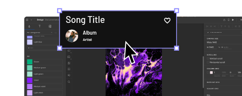
UXPin’s intuitive interface makes it easy for designers to align and distribute items and text using Positions and Dimensions in Properties Panel or keyboard shortcuts.
Auto Layout simplifies alignment and distribution, allowing designers to achieve perfect layouts and organize user interfaces effortlessly. Auto Layout uses flexbox properties, allowing designers to achieve realistic UI alignment while creating a shared language and understanding between design and development teams.
Simplify your design process and achieve high-quality layouts fast with UXPin. Sign up for a free trial to build your first interactive prototype today.


