The 30 Best Google Fonts for Your Website

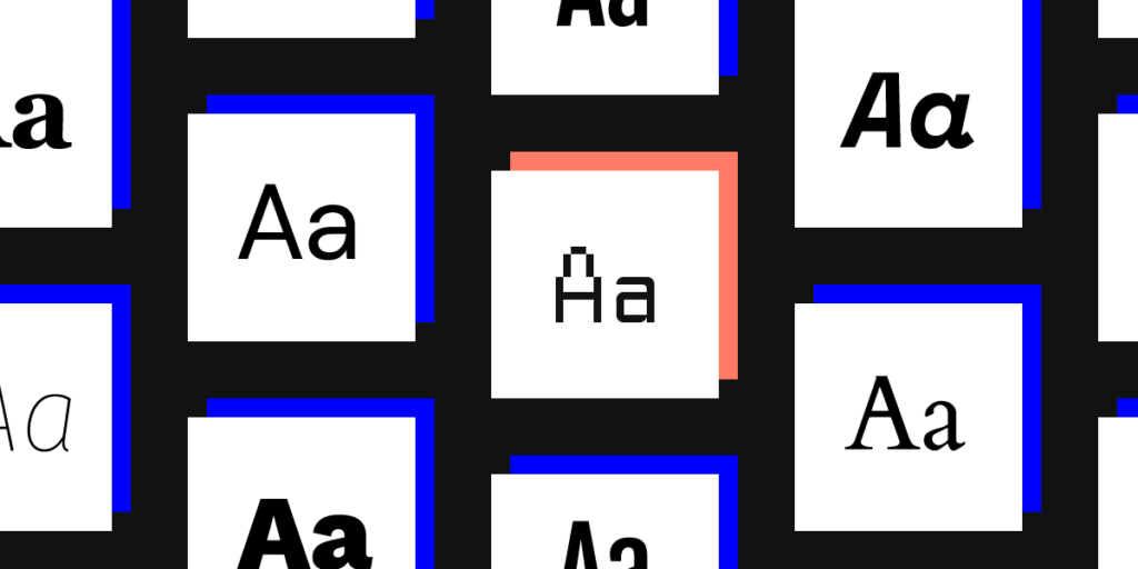
Google Fonts has a library with over 1,000 fonts that you can easily add to your website with CSS. Having access to so many options sounds great until you realize that you will never have enough time to look at them all. Luckily, you don’t have to. Explore 30 of the best Google Fonts to decide which ones will look amazing on your next website design.
To make the process even more comfortable, UXPin now lets you add Google Fonts to your prototypes. You don’t have to worry about finding a go-around that puts your favorite fonts into UXPin. Just choose an option that suits your project and get to work!
Why using the best Google Fonts matters
If you don’t work in website design, you might wonder why it matters whether you have an extensive library of fonts. As long as text gives readers the information they need, it does its job well, right? The graphics and layout make sites look appealing. Who cares about the text?
People make a lot of incorrect assumptions about fonts. Graphic designers probably recognize some of those mistaken assumptions in the above paragraph.
The biggest mistake is confusing text with fonts. Text gives readers direct information. Fonts use typography to guide the website visitor’s eye, emphasize certain pieces of information, and add to a website’s attractiveness.
Choosing the best Google Fonts for a website can also:
- Create a visual hierarchy that makes some areas of the page look more important than others.
- Control how much white space designers use on pages.
- Add contrast between the page’s background color and the text’s font.
The best Google Fonts work well on mobile devices
Perhaps most importantly, today’s website designers need to think about how different fonts will appear on mobile screens. About 81% of Americans own smartphones. Most Europeans also own smartphones.
By country:
- 81% of French adults own smartphones.
- 72% of adults in Spain have smartphones.
- 71% of Austrians own smartphones.
With so many people accessing the internet via smartphones, it makes sense for website developers to choose fonts that will look clear on small screens. The trend toward smartphone ownership will only continue. A lot of people still use desktop and laptop computers, but smartphones play an undeniable role in how people browse content, shop, and communicate.
Fonts can add to a website’s brand
Some companies invest a lot of money to have graphic designers create unique fonts that make their brands stand out. When you see Under Armour’s font, you immediately identify it with a brand that makes reliable athletic clothing, shoes, and accessories.
Other fonts that you probably associate with specific brands include those used by:
- Energizer
- Apple Abercrombie & Fitch
- BuzzFeed
- Walmart
Once you start paying attention to fonts, you can’t ignore the subtle differences that make some more unique than others. Walmart uses an interesting “t.” Apple uses a thin font that gives practically every letter “feet.” (More on those feet in the next section.)
Categories of Google Fonts to explore
Before you can distinguish the small differences between the best Google fonts, you need to learn the general categories that people use when identifying fonts.
Serif fonts

Serif fonts have small lines at the bottom of letters. The lines often look like little feet. Brands that choose serif fonts often want to look luxurious and intelligent.
Popular serif fonts used by today’s website designers include:
- Romana
- Ogg
- Garamond
If you’re not familiar with the latest typefaces, think of Times New Roman. It’s probably the most famous serif font used today.
Sans-serif fonts (often referred to simply as “sans”)

“Sans-serif” simply means “without serif.” These fonts don’t have the “feet.” Brands that use sans-serif fonts may want to create a modern, hip personality.
Popular sans-serif fonts include:
- Futura
- Circular
- Graphik
- Gotham
If you use word processing software, try Calibri to see a common sans-serif typeface.
The Best Google Fonts to Explore for Your Website Prototypes
Now, let’s look at 30 of the best Google Fonts available right now. They’re numbered, but don’t let that influence which one you choose for your next project. Always choose the best typeface for the project.

- Clean and curvy.
- Elegant appearance
- Looks strong without dominating the page.

- A readable typeface that works well for pages with a lot of content.
- Can work as a headline or content text.

- A good choice for strong, bold headlines.
- Has a traditional look when downsized.

- Clean, modern typeface that looks great as text for professional brands.

- Extremely legible, which makes it great for long blocks of text or multiple blocks.

- Unique look that not many websites use.
- A modern, fun twist on Courier

- Geometric sans serif commissioned by Google.
- Meets the needs of diverse devices and screen sizes.

- Very easy to read.
- Fresh. simple look makes it a strong choice for trendy brands.

- Manages to look beautiful and legible on screens of all sizes.

- Simple look manages to grab attention.
- Futuristic aesthetic.

- Very modern, curvy typeface.
- Wide spacing makes it useful for headlines, sub-headers, and pull-out quotes.

- Sleek look that looks great as a stand-alone sentence.
- Unique curves make it charming without losing sophistication.

- Versatile font that will look great on any device’s screen.

- Extremely readable typeface for blog posts and articles.
- Looks good with many other fonts, including Roboto and Oswald.

- Heavy typeface that demands attention.
- Automatically adjusts itself to the reader’s device.

- Works well as an eye-catching display font.
- Thoughtful spacing makes it a good choice for text blocks.

- A font for all languages, making it suitable for websites used by people around the world.

- Has rounded terminals that guide the eye from one word to the next.
- Not an extremely popular option for websites, so you can use it to stand out.

- Modern aesthetic that exudes sophistication.
- A diverse typeface that can work as headlines, block quotes, and sections of text.

- Made specifically for computer screens.
- Adapts to mobile devices.
- Looks great on pages with minimal text.

- Highly versatile typeface with 18 variants.
- Multilingual features.

- Narrow text that looks amazing as a headline but can feel cramped as long-form text.

- Very readable on desktop, laptop, and mobile device screens.
- Diverse options give designers more control over its personality.

- Attractive, modern text that doesn’t sacrifice legibility for style.
- Good option for designers who want to add contrast to pages.

- Easy-going personality that puts readers at ease.
- Diverse options make it a strong choice for designers with an eye for balance.

- Serif typeface that makes headlines stand out.

- One of the most legible Google Fonts.
- Versatility makes it useful for text and headlines.

- Professional typeface for brands that want to reinforce trust and expertise.
- Easy to read.
- Works well in print and on screen.

- Stylized functional typeface that works in nearly any situation.

- Doesn’t distort regardless of screen resolution
Get started with a free trial from UXPin
Start adding the best Google Fonts to your website prototypes today by signing up for a free trial with UXPin. Once you see how UXPin makes it simple for you to create amazing websites, you’ll understand why so many other designers choose it.

