You asked. We listened. Google Fonts have come to UXPin.
Typography is described as the “voice” of text, but with tens of thousands — if not more — of type families on the market, constraining oneself to a few dozen isn’t always easy.
Many web developers look to Google Fonts to boost their online designs. Now you can choose from both libraries to make your UXPin prototypes more closely match the finished products. Through our new Typography panel — plus a new modal window — you can manage dozens of type families. All of the available Google Fonts are a few clicks away.

So what’s new?
- A wider range: Choose from the collection of Google fonts for your designs.
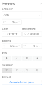
- This is heavy: Choose both type family and specific weight, like extra bold or light, in the new Typography panel on the right side of the Editor.
- Liberate your library: Don’t need all of the standard fonts? Prune back your default font list in the new Font Management modal window.
- Spaced out: Control tracking, or the average space between characters in a block of text.
The typography panel lets you search by font name. You can browse by source — Google or standard web fonts — and apply them to one or more text boxes in your prototypes.
What if you open a team member’s project that doesn’t have one of your fonts? You’ll get an alert message, but don’t fret. The text will load with its appropriate font, and you can use it — within the project at hand.
With the new panel and a ton of new fonts, you can better customize and standardize your UI in UXPin. See it for yourself!


