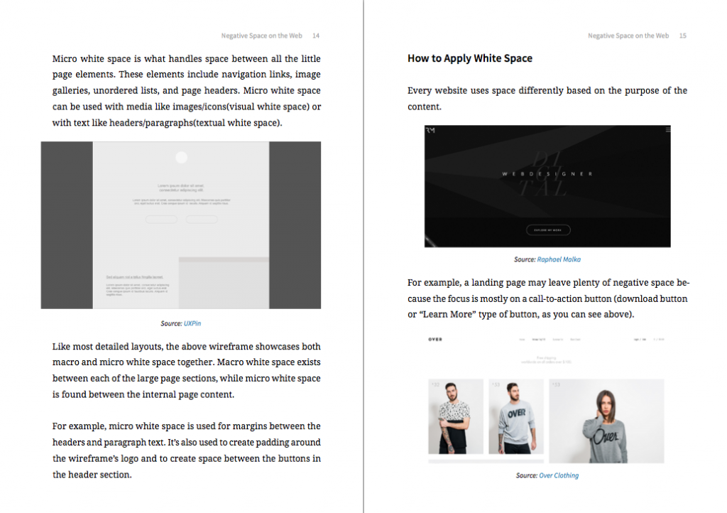
White space – or negative space as it’s also known – is a highly misunderstood and underappreciated component of proper UI design. That’s why we wrote our latest ebook, Zen of White Space in Web UI Design, to clarify its importance and explain its application, using 14 real examples from companies like Apple, Lever, Wanderlust, Sketchapp, and more.
Take a peek inside!
“Less is more” is the fundamental principle that gives white space its strength. By adding or subtracting empty space around certain elements you can draw/repel attention, highlight their importance, and even exude certain moods, such as elegance.
What’s Inside…
Over 58 pages, this free ebook explains why white space is a lot more than empty space.
After reading this book, you’ll know:
- The principles that govern white space, taken from the history of aesthetics, and applied to web design
- The differences between compositional, visual, and textual white space
- How to create visual hierarchy and draw attention with white space
- How to build a comprehensive and attractive layout structure
- Why white space is especially important for single page sites
- The power of spacing for grouping, chunking, and navigation
This free ebook is available to download right now. If you find it helpful, feel free to share.


