What is Component-Driven Prototyping?

Component-driven prototyping is the next iteration of user experience design. Designers no longer design from scratch, and engineers write less code.
The result? Better cross-functional collaboration, faster time-to-market, superior consistency, fewer errors, better testing, meaningful stakeholder feedback, and smoother design handoffs.
Sound too good to be true? All of these benefits are possible and more with UXPin Merge. Visit our Merge page for more details and to request access.
What is Component-Driven Prototyping?
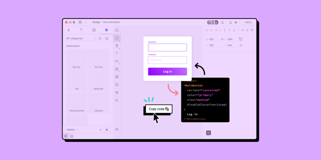
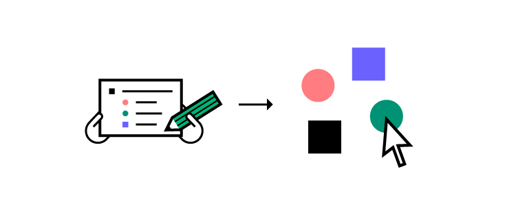
Component-driven prototyping is a product design methodology where designers use ready-made UI elements to build user interfaces (UIs). Instead of designing from scratch, design teams drag and drop interactive components to build prototypes.
This design methodology originates from component-driven development, where front-end engineers build UIs using an existing component library rather than coding from scratch.
Storybook is a popular tool for this development strategy, allowing engineers to build and manage components in isolation.

Component-driven prototyping works similarly. Instead of designing from scratch, design teams focus on building UIs with ready-made components using an open-source UI library or the product’s design system.
The components are usually fully interactive with defined properties, like color, typography, size, style, etc., allowing designers to prototype, test, iterate, and deliver design projects much faster with greater accuracy.
Component-Driven Prototyping Methodology
While component-driven development was the inspiration behind component-driven prototyping, Brad Front’s Atomic Design principles are the foundation for the design methodology.
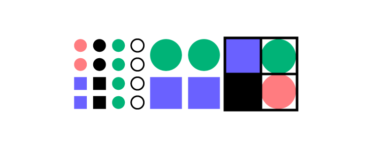
Atomic Design uses a progressive approach to building UIs, starting with the smallest UI elements and scaling. Instead of designing from scratch, designers combine these elements to create larger components, templates, and complete user interfaces (pages).

Atomic Design’s five elements include:
- Atoms: Foundational UI elements like HTML tags, fonts, animations, and color palettes. Designers cannot break these elements down.
- Molecules: Atoms combine to create small, interactive components like form labels or input fields.
- Organisms: These complex UI components offer greater interactivity designers use to solve usability and accessibility problems. Examples include logos, search fields, and primary navigation.
- Templates: Define the structure for different website/application sections, like a blog feed, carousels, testimonials section, or footer. Templates include a grouping of atoms, molecules, and organisms to create these larger structures.
- Pages: A complete screen using a collection of templates to create a cohesive user interface that aligns user needs with business goals.
8 Benefits of Component-Driven Prototyping
1. A Single Source of Truth
The most significant benefit of component-driven prototyping is enhanced collaboration between design and development. Designers and engineers work with the same component library hosted in a repository or in an npm package or Storybook.
A tool like UXPin Merge facilitates this connection between design and development, giving departments access to a single component library. Design teams use visual UI components, whereas engineers see the code behind them–the same elements from different perspectives.
2. Design Consistency
This single source of truth is excellent for maintaining consistency across design and development. With built-in interactivity and styling, designers only have to worry about combining UI components to create user interfaces, eliminating common issues like variations in color, typography, sizing, border radius, correct iconography usage, etc.
Design consistency also benefits engineers who receive approved, uniform components and user interfaces–crucial when multiple teams work on the same product.
3. Shareable
Sharing components across design teams helps to maintain design consistency while streamlining UX workflows and designer collaboration.
While static UI kits allow designers to share UI elements, these kits lack fidelity and functionality. Designers must set these up themselves, leading to interaction design inconsistencies and drift.
Sharing a component library gives designers visual elements, interactions, styling, and any other constraints the design system sets.
4. Smoother Design Handoffs
The design handoff is traditionally a stressful, fiction-filled process for designers and engineers. Designers use tools, videos, documentation, and static designs to demonstrate what a prototype is “supposed to do.”
Design handoffs in a tool like UXPin Merge eliminate uncertainty and reduce documentation because engineers have the same components. Each component’s interaction and styling properties help designers stay within technical constraints, so engineers rarely see designs they can’t replicate.
5. Meaningful Feedback
Usability participants and stakeholders also benefit from component-driven prototyping. Fully interactive prototypes give everyone realistic expectations of the final product and its capabilities. The higher fidelity and functionality mean design teams get meaningful, actionable feedback from stakeholders and end users.

6. Faster Iterations
Designers can iterate on feedback from testing and stakeholders much faster using a component-driven prototyping workflow. The drag-and-drop design process and easy access to properties enable designers to make changes on the fly. PayPal experienced this increased efficiency after switching to UXPin Merge:
“We build high-fidelity prototypes much quicker, and we get immediate feedback after the session. If there’s something we can fix immediately, we make that change before the next participant and get feedback much faster than before.” Erica Rider, Senior Manager for UX – Developer tools and platform experience at PayPal.
UXPin Merge users benefit from a tool like Patterns, allowing design teams to save multiple versions of a single component in a shared pattern library. Instead of using UXPin’s Properties Panel, designers switch out UI elements and patterns to iterate faster.
7. Built-in Responsive Design
Responsive design is a time-consuming task for designers. They must create multiple layouts for a single screen, adding significant time to design projects. A better solution is to develop responsive components, so designers only have to build one prototype for all layouts.
With Merge’s component-driven prototyping solution, the design system team can wrap components in an iFrame to make them responsive to multiple viewports. Designers can switch between these layouts using a dropdown when previewing designs.
8. Scaling Design
The drag-and-drop nature of component-driven prototyping means non-designers can build prototypes at higher fidelity and functionality than highly skilled UX designers using image-based design tools.
When PayPal switched to UXPin Merge in 2019, they were able to train product teams to complete 90% of design projects. UX designers mentored product teams and helped with complex usability issues–reducing the need for more UX professionals while allowing them to focus on high-level user experience initiatives.
A component-driven workflow significantly reduces the learning curve and speeds up prototyping, making the design process more accessible to non-designers.
Companies Using Component-Driven Prototyping Workflows
PayPal and TeamPassword both use component-driven prototyping to eliminate inconsistencies and provide positive user experiences for their customers.
We chose these examples because PayPal is a massive multi-national organization, while TeamPassword operates with a small team.
Both companies have experienced significant benefits from switching to UXPin Merge and adopting a component-driven prototyping workflow.
PayPal
PayPal is a fantastic component-driven prototyping success story. After switching to UXPin Merge, the organization delivers design projects 8X faster than they were previously using image-based design tools.
“We did a one-page vector-based design with another design tool we use at PayPal. And then the exact same prototype in UXPin using our Merge component library. Using Merge, our designer took around eight minutes, while using the other design tool, the same prototype took over an hour!” Erica Rider, PayPal
PayPal’s component-driven workflow makes everyone involved in product development responsible for user experience. Most importantly, component-driven prototyping empowers PayPal’s product teams to take on more design responsibilities.
“A common internal issue is that product teams often see UX design as a bottleneck. So, our strategy was to start with removing that bottleneck and enabling the product teams to do the design on their own.” Erica Rider, PayPal
TeamPassword
Password management is a highly competitive industry where organizations must win trust to secure and retain customers. Design plays a significant role in strengthening the brand and creating consistent user experiences that earn customer trust and loyalty.
“Customers entrust us with sensitive information in their login records. Inconsistencies or an outdated design can cause some customers to question whether we are technologically up to date enough to keep that information secure. Front-end development builds trust and confidence in the backend performance.” Tony Caccavo, Director of Operations at TeamPassword
TeamPassword uses open-source component libraries instead of designing from scratch and doesn’t have a design team for prototyping and testing. Instead, TeamPassword’s front-end developers use UXPin Merge to prototype and test new UIs and features.
This component-driven workflow allows TeamPassword to design, test, and ship products quickly with high consistency–vital for operating in such a competitive landscape.
How to Start Component-Driven Prototyping?
Creating a single source of truth between design and development is easier than ever. UXPin Merge allows organizations to import a component library, so designers and engineers use the same UI elements.
Importing Components
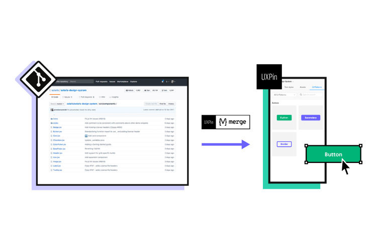
Designers can import an open-source component library using UXPin’s NPM Integration or, with help from engineers, sync a product’s design system using Merge’s Git or Storybook integration.

Prototyping
The design process is the same whichever method you choose to sync components with UXPin.
- Drag Merge UI elements onto the canvas and make changes via the Properties Panel. You can also combine elements using UXPin Patterns to create larger, more complex components.
- Connect components to build prototypes for usability testing or present to stakeholders.
- Test and iterate until you find the perfect solution. UXPin allows you to test in the browser with Preview and Share or use UXPin Mirror for mobile testing.
- Add documentation to your project and collaborate with engineers using UXPin Comments during the design handoff.
Merge’s Single Source of Truth
UXPin Merge serves as a single source of truth across the organization, helping to manage and scale your product’s design system. Any changes to the component library’s repository automatically sync to UXPin’s design editor, notifying teams of the update.
UXPin Merge’s Version Control keeps track of releases and allows designers to switch to an earlier version, giving complete control over updates.
Ready to give component-driven prototyping with UXPin Merge a try? Visit our Merge page for more details and how to request access to this revolutionary technology.


