Erica's challenge: she only had three designers (including herself) for over a thousand developers and more than sixty products to oversee.
Challenges
To support such a large organization with only three UX designers, PayPal’s team had to figure out how to design faster while bridging the gap between design and development.
To solve this issue, PayPal’s UX Manager and her team decided to focus on improving three aspects of product development:
- Scale
- Consistency
- Product drift
Scaling
The first restriction to scale was that Erica wasn't going to get more UX/UI designers. She had to find an innovative solution to scale design itself rather than her team.
"Before I joined PayPal, I had this theory that to scale design effectively meant that we had to include developers and product managers in the design process. I just didn't know how we were going to do that. I knew the what, but I didn't know the how. UXPin and Merge have helped us scale design without requiring a large team of designers."
Erica Rider, Senior Manager for UX,
She decided the best way to scale was to empower PayPal's product teams to take a more active role in the design process, reducing the need for more designers.
So, Erica and her small team started with a traditional UX scaling model – increasing the cohesiveness of the design system. To achieve this, PayPal's three-person UX team would have to:
- Write and maintain documentation for tools and processes.
- Train product teams about UX principles and how to design.
- Teach product managers about PayPal's 60+ products at once.
It was clear that this strategy wouldn't work with the small UX team. They had to simplify the design process and minimize the tools product teams would have to learn.
Consistency
When Erica arrived at PayPal, there were significant consistency issues within their internal products – no two products looked the same, and there were no experienced UI designers to guide product teams.
It was going to take a lot of work to unify PayPal's internal product design!
Product Drift
Lastly, the UX Manager at PayPal had to solve a gap between design and development caused by traditional vector-based design tools. The vector-based prototypes didn't provide developers with the level of information they needed to engineer the final product.
As a result, teams lost a lot of time and resources fixing inconsistencies between design and development.
PayPal's Innovative Solution
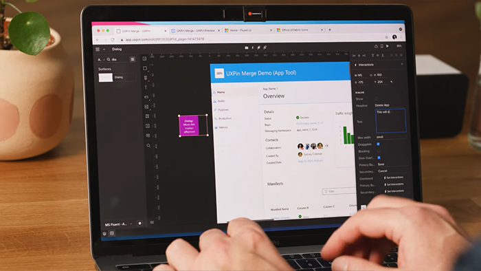
After trying several tools, Erica came across UXPin Merge – a code-based design tool with the technology she needed to bridge the gap between design and development.
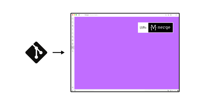
Merge allowed PayPal to sync UXPin's design editor with one of the company's Git repositories (also available as a Storybook integration) so design teams could build products with fully functional UI components. The exact same components engineers used to develop the final products.
Cutting down the time to market
To test the efficiency of this new product design process, PayPal decided to compare designing a one-page product in UXPin Merge vs. a popular vector-based design tool.
The results exceeded their expectations – UXPin Merge was 8 times faster!
The designer built a one-page design in 8 minutes using UXPin Merge, while it took over an hour for the exact same prototype using a vector-based tool. The UXPin prototype also had a more consistent standard and much higher functional fidelity in terms of interactions.
It's important to point out that the experiment was conducted by an experienced designer, highly competent with a wide array of design tools. So even with lots of training, non-designers in product teams wouldn't be able to design with a vector-based tool at that pace.
"It used to take us two to three months just to do the design. Now, with UXPin Merge, teams can design, test, and deliver products in the same timeframe. Faster time to market is one of the most significant changes we've experienced using Merge."
Erica Rider, Senior Manager for UX
Erica used UXPin Merge to eliminate the steep learning curve so product team members could join the process and build prototypes without time-consuming guidance and support. They don’t have to design from scratch as the components have been already prototyped and developed. So just by dragging and dropping elements in the design editor, product teams can create fully interactive prototypes as all the interactivity is built in the components. That takes away the pain of having to learn about the advanced functionalities of the design tool.
Maintaining a consistent experience
PayPal synced UXPin's design editor with Microsoft FluentUI design system components hosted in a company’s Git repo. Product teams could simply drag and drop the elements they needed to "snap-together" products on the canvas.
All the components from PayPal’s design system were built and checked to be in line with the company’s standards. These approved elements gave product teams the freedom to build products while maintaining a high degree of consistency and cohesiveness for the user experience.
UXPin Merge worked perfectly for PayPal because it provided a sophisticated low-code design tool for non-designers to build products to the same standard as experienced UX designers. The new process also eliminated the inconsistencies between design and the products that PayPal experienced in the past with vector-based design tools.
Redefined design process
Merge allowed PayPal to scale its design and build a new end-to-end DesignOps process. More importantly, it allowed for scale without a need to hire new designers.
Their new process included:
- Product teams research the users' needs.
- Product managers design interfaces using UXPin Merge and UX insights from user research.
- PayPal's internal UX designers inspect the product team's work for any inconsistencies.
- Product teams hand off UXPin prototypes to Developers who copy the code from components to build the final product.
The result: product teams can complete 90% of the work on their own, only getting help from designers when they're stuck on challenging problems. On the development side – engineers can take a prototype and write working code within one sprint.
The impact of UXPin Merge on PayPal as an organization
Some of the most impactful changes of using UXPin Merge at PayPal included:
- Increased design velocity
- Empowered product teams
- Improved consistency across all internal products
- Reorganizing the design process and switching to a single design tool created a substantial positive shift for PayPal's internal teams.
"Our Design Ops process is truly an end-to-end process. It's about product teams, really understanding who their users are, doing design based on their users' needs, enabling domain experts to do that design based on their knowledge and testing, and validating how successful their design was."
Erica Rider, Senior Manager for UX
Customer-focused
To improve product user experience, Erica believed that everyone – not only her small UX design team – needed to focus on the end-user.
So, the UX team educated product teams about design thinking and how to understand fundamental user challenges. This training gave everyone a big-picture perspective to consider the complete user experience.
Additionally, it got significantly easier and faster to improve user experience through testing. With fully functioning prototypes built in UXPin Merge, PayPal's product team gets immediate feedback from participants and can apply changes right away. These high-fidelity prototypes also improved final product quality.
"The C-suite and the directors can give us stronger feedback about the ultimate direction because they experience the features and goals of these prototypes rather than just commenting about how these boxes don't look like a text field, for example."
Anthony Hand, Sr. UX Designer,
Collaboration
Smooth collaboration between managers, designers, and developers helped eliminate PayPal's product drift, break down silos, and get rid of handoff process bottlenecks.
It's a truly collaborative effort where everyone has a say in the design process. There's consistency across all of PayPal's internal products, and everyone is more productive.
"Thanks to our new approach based on the power of UXPin, we see more of a collaborative process and integration. There's not a discreet end from the design and prototyping stage to the execution stage. This is much more of an integrated flow, and we're engaging our engineering and product management team throughout that process."
Anthony Hand, Sr. UX Designer,
Focus on what matters most
UXPin helped PayPal scale its design process to tackle global-level problems across the entire department of developer tools and platform experience.. Now they can focus on understanding how people use products, where they can improve, and how to build trust in the platform.
PayPal admits that they wouldn't have achieved this without UXPin's Merge technology to increase design velocity while empowering product teams.
"My design team spends 50% of their time supporting various product teams, and the other 50% is spent on larger UX initiatives that impact the organization globally."
Erica Rider, Senior Manager for UX,
UXPin with Merge technology helped PayPal's design team solve significant challenges to scale its design without hiring more UX designers.
If UXPin Merge can eliminate the need to hire more designers, reduce the time to market, and improve design consistency at a massive multinational corporation like PayPal, imagine what it could do for you?


