Fintech Design – A Compilation of the Best UX Tips for Product Designers
FinTech is a challenging industry for any discipline, but especially so for UX designers. FinTech design requires designers to study financial regulations, which could differ between states and countries. These financial regulations are often detailed and extensive, meaning lots of reading before designers can even begin a project.
This article explores the basics of FinTech product design, including best practices to ensure your products are user-friendly, compliant, and provide maximum value to your customers.
Whether you’re a FinTech startup designing a cryptocurrency product or an established multinational looking to revolutionize its mobile banking app, UXPin provides a technology that allows you to design prototypes with interactive components that come from your design system. Find out more about it.
What is FinTech?
FinTech (Financial Technology) describes a market sector that produces financial technology products and services. These financial products include applications, APIs, or even algorithms that seek to innovate and improve the industry.
What are examples of FinTech?
Here are some FinTech examples:
- Digital banking (also called Neobanks): Monzo (UK), Chime (US)
- Digital wallets: Payoneer, Skrill, Revolut
- Payment services: PayPal, Venmo, Cash App, Stripe
- Investment services: Robinhood, Betterment
- Crypto products: Coinbase, Ripple
Check out Insider Intelligence’s article on FinTech startups for more FinTech examples.
Fintech UX Design Challenges

1. The Challenge of Compliance
Regulatory compliance is one of the biggest FinTech design challenges. If you’re designing a product for multiple countries or a global audience, your designs might change for each market to comply with different laws.
For example, regulations like Anti-Money Laundering (AML) and Know Your Customer (KYC) have detailed protocols which impact onboarding and user flows. These regulations add extra layers of complexity relating to user identification, privacy, fraud prevention, accessibility, and even terrorism, to name a few.
To complicate things further, states and countries update these laws or introduce new ones regularly, meaning UX researchers and designers must revise designs to maintain compliance–which could disrupt the product roadmap or UX strategy.
2. Meeting Customer Expectations
Aside from regulation, user experience designers also have to overcome customer expectations from legacy banking and financial services. For example, many neobanks don’t have physical branches for customers, so the app must provide tools and features that replicate the in-person experience.
3. Embracing Product Complexity
Another challenge for FinTech design is the product complexity and how UX designers create a cohesive ecosystem. Something Forbes refers to as a “switch from fragmentation to ecosystem.”
Traditional banking and financial providers have different departments working on each product—for example, credit, cheque, savings, mortgage, loans, etc. Design teams risk designing fragmented products rather than a holistic ecosystem with a seamless customer experience without proper communication and collaboration.
4. Security Protocols
FinTech security protocols impact UX workflows and how designers conduct, share, store, and analyze research. UX teams must comply with various security protocols, like ISO-27001 and ISO-27002.
UX designers must also encourage users to adopt safe practices, like secure passwords, not sharing OTPs (One Time Pins), or being cautious with text and email links.
8 FinTech App Design Tips

1. Clean UI Design
Clean, minimal UIs are essential for any digital product, but more so for FinTech designs which must often make space for disclaimers, policy links, and other required information.
Progressive disclosure is a popular strategy for designing complex FinTech UIs. UX designers only display critical and required content to users with additional information “hidden” behind tooltips, dropdowns, accordions, modals, and other UX patterns.
Using a progressive disclosure approach helps designers create clean UIs while providing users with content when they need it.
2. Clear and Simple Language
Financial products and services are notoriously difficult to understand, with terms and conditions too long and complicated for most people to comprehend.
Simplifying language and providing users with clear expectations are crucial for FinTech product design. It also helps build trust with users who may not understand financial jargon or the implications.
For example, a credit application could affect a user’s credit score. UX designers must explain this and other critical information within the constraints of a mobile screen, usually in a few bullet points.
3. Accessibility
Accessibility is essential for any digital product, but it’s especially crucial for FinTech designs. In countries like Norway and Australia, products must meet Web Content Accessibility Guidelines (WCAG) 2.0 level AA standard.
This article from PowerMapper provides a list of countries and their relevant accessibility requirements.
4. Helpful Visualizations
Visualizing data helps users digest and understand information quicker. UX designers can also use colors to separate figures, like income vs. outgoings.
5. Use Appropriate Keypads
Completing forms on a mobile device requires users to switch between numbers, letters, and special characters. FinTech forms are typically longer than other digital products, with more fields for users to complete.
UX designers can streamline this process by telling mobile devices which keypad to use, including:
- Number-first keypad
- Date picker
- Email field (ensures @ and .com appear on default)
6. Use Descriptive, Helpful CTAs
There must be no misunderstanding about what will happen when a user clicks a CTA. For example, if someone is completing a loan application, the form’s CTA must “Apply” rather than the usual “Submit” or “Send.”
7. Help, Don’t Hinder
Sadly it’s still common to see digital products hiding features that allow customers to cancel or downgrade a service. UX designers must always seek to help users complete tasks, including those that would enable customers to end a subscription or opt-out.
There might be clear guidelines for opting out of paid services in some jurisdictions, so always ensure your designs meet regulations and best practices.
8. Optimize for Mobile
Many users (especially under 30s) want to complete tasks on their mobile, either through a mobile application or browser. If your FinTech product doesn’t have a mobile application, ensure the website/web app is optimized for mobile users, providing the same experience as desktop.
If you have a mobile application, make sure users can complete the same tasks as they would using a desktop. Many products limit what users can do via a mobile app which can cause frustration or have negative implications–like not being able to downgrade a service or canceling a recurring payment.
Overcoming Common FinTech Usability Challenges

Here are some common FinTech UX scenarios and how to overcome them. We’ve taken these examples from Google’s UX Playbook for Finance.
Educating & Converting Users
One of the challenges designers face is educating users about complex financial products while getting them to convert. Here are some recommendations for a typical mobile onboarding flow:
- Use bullet points to summarize your offering and regulatory information
- Keep value proposition above the fold with CTA to reduce scrolling and increase the likelihood of conversion
- Reiterate value proposition at the top of onboarding forms
- Include social proof (TrustPilot widget) to build credibility and trust
- Use clear CTAs, i.e., “Sign up and Get Quotations.”
- Prefill form fields when an existing user applies for a new product or service
- Use progress bars to show users where they are in the process
Displaying Large Amounts of Data
FinTech products often have to display lots of data on a single screen, especially challenging on mobile devices with limited real estate. Here are some recommendations to help maximize space and reduce cognitive load:
- Ensure primary CTAs standout with descriptive labels
- Use outline/ghost buttons for secondary CTAs
- Use color and consistent spacing to separate content
- Create a clear distinction between headings and body copy
- Use an easy-to-read, legible typeface
- Hide secondary content behind carousels, accordions, and tooltips
Streamlining Long Forms
FinTech products often have to collect a lot of personal information to comply with legislation. These forms can take a long time and could appear overwhelming to users. Here are some tips to streamline long forms:
- Tell users how long you predict it will take to complete the form at the beginning to manage expectations.
- Divide your form into sections and separate these into steps (make sure users can easily navigate forward and backward at all times).
- Use progress indicators to show how much users must still complete.
- Only ask for the information required to complete the application. Avoid redundant fields like the person’s title, gender, and race that aren’t irrelevant to financial institutions.
- Don’t use dropdown menus for fewer than three options. A radio or checkbox makes for quicker selection.
- Allow users to save progress to return when they have time.
- Use numeric keypads for appropriate fields (date of birth, contact numbers, US zip codes, credit card numbers, etc.)
- Provide helpful placeholders and error messages to guide users. Error messages must have clear, actionable instructions for users to fix the problem.
Build Products 8X Faster With UXPin Merge
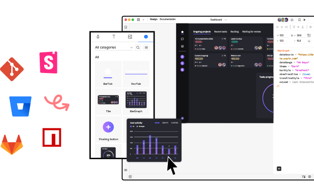
Merge is a design technology that allows orgs to sync a component library to UXPin’s editor, so designers can build prototypes using fully functioning coded UI elements that developers use to at the production stage.
Curious to see how UXPin Merge could revolutionize the workflows of your business? Learn more about Merge and see how you can get started with it.


