How to Choose the Right Mobile App Design Software?

App design tools help craft smoother design processes – breathing life into concepts and bringing teams closer together.
However, mobile app development processes are often fraught with frustrations. Especially at the design handoff stage, which can derail the entire project through an endless volley of back-and-forths.
If you’re struggling to foster cross-departmental collaboration, if your user interface designs aren’t coming out like the prototyping tool promised, or the workflow feels inefficient, then looking for a better alternative to your current mobile app design tool is a must.
But what key features should you look for when choosing your app design software? Let’s see what are your options if you want to build a prototype of your next mobile app, gather feedback, and pass your product design to developers for their app building process.
App Design Software – 7 Must-Have Features
1. Creating lifelike, interactive prototypes
Any app design software needs to let you build prototypes for various stages of your design process. You may want the start with creating wireframes – basic, non-functional templates used to communicate a broad outline of your UI design, so this is the feature you may focus on.
But you’ll also need to design fully functional mock-ups that look, work, and feel exactly like the finished mobile application. These are essential when conducting user testing and gathering feedback (which helps to make your app user-friendly.)
A top app design tool like UXPin makes it simple to innovate designs at every stageof a mobile app design.
UXPin will let you build an interactive prototype that’s high-fidelity by default. By setting up custom triggers and conditional interactions, which only activate after a user performs a specific set of actions, you can effectively breathe life into previously non-interactive prototypes – whether it’s a simple click-through or advanced animations.
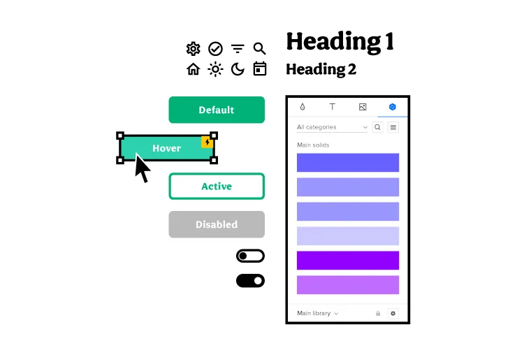
The app design software makes it really simple to create more than one default state for these elements. You can create a single button with default behavior depending on a user’s action. To help tailor the experience further, variables offer a way to store inputs and take actions based on that data.
Ideally, you want your prototypes to mirror the final product as closely as possible. It’s vital, getting buy-in from stakeholders in the company, gathering user feedback, keeping everyone working on the project on track, and nailing that awesome vision for eCommerce store, Android application, or an Apple plugin.
But one of the biggest obstacles to keeping that vision ‘pure’ is the back-and-forth between design and development. An exasperated ‘I want it to X’ met with an equally exasperated ‘It doesn’t work like that, the transitions are completely off.’
That’s why you need a design tool that doesn’t have a huge learning curve for your developers to get it. Tools like UXPin has a Spec mode in which your engineers can inspect the design, be it for a web app or mobile one, and clearly see what should be built and how it should behave before they start implementing the prototype in their development platform.
2. Easy design handoffs
Design handoffs are a tricky part of the process. Design proudly hands over their brilliant ideas – only to be met with stone-code reality. Bottlenecks are pretty common, irritations become frustrations, projects feel like they grind to a halt as the teams go back and forth with fresh ideas to make it all work as imagined.
Any UX app design tool worth its weight in gold needs to make these handoffs smoother. For the good of the design process and everyone involved in it.

Because UXPin is a high-fidelity app design tool, developers will be immediately familiar with the components laid out by designers (and design projects automatically generate CSS details for devs). Just to keep everyone on the same path, all project-specific specs and documentation are a few clicks away.
The result is a smoother design handoff. Designers know what’s possible and developers know how it all works. Some designers are using Zeplin or Marvel to pass on their designs from Figma or Proto.io to developers, but with UXPin you can design interactive prototypes of MacOs, Android or web apps, and hand them over to developers without switching to another tool.
Other people skip prototyping phase and they go straight to no-code app builders. It’s okay to use them when you’re a beginner who learns their craft or if you are making an MVP, yet complex, comercial apps may find no-code solutions hinder their ability to scale.
3. Designed for fast iterations
A robust design process goes big on iterations. They’re a snapshot of the project at various stages. Instead of sharing an actual work in progress, you can link to previous iterations to help you assess design ideas (and assumptions, thoughts, and hunches).
Ideally, your mobile app design tool needs to be able to quickly create iterations of a project – and just as quickly let you pull up an older iteration if user testing reveals a flaw in the latest design. In UXPin, you’re easily able to grab past iterations.
UXPin Merge extends that level of control to all your different versions. At best, using different design system versions for different prototypes can be frustrating. At worst, they can derail the workflow. UXPin Merge makes it quick and easy to manage and move between each project’s library.
4. Ability to manage the design system within your app design tool
A design system is a set of standards and standard components used by everyone on the project to design and develop a product. Think of it as a bible for your mobile app design that says, ‘This is the way.’
Teams that build without a design system in place don’t just risk the odd bit of inconsistency for users looking for intuitive, frictionless experiences. They risk hitting the brakes on the design process, as time and resources are thrown away creating and recreating components.
When you’re looking for the best app design tool, Design System management is a necessity.

In UXPin, the Design System lets you create and maintain a comprehensive library of interactive components to ensure consistency from design to development and beyond.
Your Design System is a way of ensuring consistency across your brand with a clear style guide, component library and what not that set you apart from the competition. If you want a tutorial on building a design system, go to our open web eBook where we outline the steps of creating a design system.
5. Using real data inside the project
Prototypes don’t always need to feel like prototypes. When they’re two steps up from a sketch on a napkin, that’s fine. However, as your project begins to take form, you’ll want to start populating the prototypes with real-life data that replicates what users might actually see, like names, cities, and text, and images.
That doesn’t have to mean hours spent downloading stock images and copy-pasting lorem ipsum. UXPin lets you insert and sync real data into prototypes, giving designs a detailed polish. Teams can see how the finished article should look.
But a bigger benefit comes during user testing. If your app design tool can more accurately recreate the real-life UX design, then user feedback becomes much more valuable and actionable (and they won’t be distracted by immersion-breaking walls of lorem ipsum).
6. Advanced collaboration features
Collaboration is the backbone of the creative industry. You only have to look at how a vague but genius flash of inspiration in one mind grows into a fully realized app to see that. And with the rise in hybrid working, choosing a mobile app design tool means choosing advanced collaboration features that bring teams together, remotely and in real-time.

UXPin makes live collaboration as easy as possible. With Slack and Jira integration, in a few clicks you can transform communications and project management, and improve visibility over any design edits made by team members.
Whether you’re working in real-time on a design, sharing project status with the team via email or Slack, or waiting for stakeholder approval, UXPin’s collaboration tools keep colleagues on the same page.
7. Sharing your designs with the team
Sharing isn’t just caring. It plays a strategic and tactical role in successful collaboration. Designers bounce ideas around with each other. When the thoughts start flowing, it can be hard to keep track of all the brilliant concepts. It means the right mobile app design tool needs to be equipped with friction-free sharing options to effortlessly communicate ideas that might make the design an even bigger success.
Let’s start with the basics. UXPin supports the popular PDF, PNG, and HTML exports – so as long as your colleague can turn on a computer, they can probably view your designs.
The UXPin Mirror app, meanwhile, lets authorized users live-preview prototypes on mobile devices. It’s a great way to see how your app looks and feels, with edits updated in real-time to make before-and-after comparisons a breeze.
These app design tools make it easier to collect feedback from the rest of your team to refine a product into its best possible iteration.
High-fidelity Prototyping with UXPin
Not all app design tools are equal, though. And not every tool packs features that seamlessly drive you from initial idea to final iteration. It’s critical to assess where your current processes are lacking and how a tool like UXPin can improve them. This can be done through real-time collaboration and smooth design handoff that let design and development teams work seamlessly.

