Design Handoff Checklist – 47 Points that Will Guide You Through the Process

Is design handoff stresses you out? It won’t anymore. Let’s see the exact tasks you need to do to make design handoff better. Let’s explore!
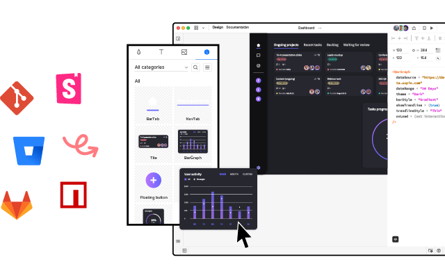
Design handoff doesn’t need to be point of friction between designers and engineers. Use UXPin Merge and bridge the gap between those teams by using a single source of truth. UXPin Merge allows you to bring reusable UI components from devs’ component library to the design editor and make them accessible to designers. Learn more about UXPin Merge.
47-Point Design Handoff Checklist
We’ve created this simple 47-point checklist as a guide for your next design handoff. If you want to learn more about the process itself, head on to our previous article: Create a Better Design Handoff.
During Design
Discovery:
- Invite developers to attend user interviews when possible.
- Circulate bulleted summary of user interview insights with developers.
- Conduct a 30-minute to 1-hour stakeholder interview with at least one developer. Use Kim Goodwin’s excellent questions.
- Create and quickly review lean personas with developers.
- Get developer input and alignment on technical restraints for the design brief.
Planning:

- Ensure developers (or at least the development lead) attends the kickoff.
- Conduct user story mapping with developers to plan epics and sprints.
- Estimate build time for user stories with developers using tactics like planning poker.
- Plan 1-2 design sprints ahead of the development process.
- Check which framework the designs must use (Bootstrap, Foundation, custom, etc.). Adapt grids and elements accordingly.
- Verify browser support with developers.
- After each standup meeting, quickly review the backlog with developers.
Prototyping:
- Walkthrough user flows and lo-fi prototypes for developer feedback on feasibility.
- Start designing extreme viewports (smallest and largest) to accurately “bracket” your content. Consider how your design will respond to screen sizes slightly smaller or larger than your assumptions.
- Incorporate rough content (not Lorem Ipsum) into the prototype within the first two iterations.
- Invite developers to attend at least one user testing session.
- Prototypes account for all interaction states, error states, and transitions between states.
- Prototypes account for data extremes (e.g., short and long last names, phone number formats, non-US postcodes).
- Circulate all user test recordings with a bulleted summary of insights to developers.
- Collect feedback and approval from developers at each iteration of the prototype.
UI Design:
- With each iteration, rename your design file (v.1, v.2, etc.). Do not rename “Latest” or “Newest.” Upload every new version into a shared repository.
- Create as many reusable patterns as possible (menus, links, buttons, panels, etc.) so developers have a component-based system.
- Make UI decisions that create consistency for the user experience and codebase.
- Get developer buy-in on image formats and sizes.
- Create designs in all significant breakpoints on a grid system with guides/overlays.
- To preserve typographic integrity, use whole font values and leading values (e.g., 15 instead of 15.75).
- Use web-safe fonts when possible. Don’t use more than one custom font.
- Check that you own the rights for all photography and typography.
- Hold a 30-minute to an hour review of final approved mockups alongside the prototype: walkthrough project goals, user stories, interactions, states, and failure states.
During Handoff

Visual Hygiene:
- Delete all unused layers. Don’t just hide them since that may confuse developers.
- Delete all unused guides.
- Group and name layers appropriately based on UI modules (navigation, footer, etc.)
- Follow a common naming convention with developers (e.g., a “widget” is not the same as a “module”). Consider using BEM notation.
- Instead of naming artboards with “FINAL” or “LATEST,” follow a standard versioning protocol (v.1, v.2, etc.).
- For easier navigation, collapse all layers before sending off designs.
Assets:
- Create subfolders within your main project containing all relevant icons, fonts, images.
- Include SVGs wherever possible. For raster files, include versions at 2x.
Documentation:
- Annotate prototypes with use cases, failure states, and interaction nuances.
- Annotate the full code snippet (or classes in frameworks) next to every element.
- Use an inspection tool to auto-generate visual specs (color codes, dimensions, font sizes, margins, padding, etc.). Avoid redlining as much as possible.
- Ensure all documentation stays updated to reflect the final system as it evolves. Developers will refer to the documentation to understand the depth and breadth of the system, using the final prototype as a reference for acceptable behaviors.
After Design Handoff
Accuracy of Build:

- Designers perform an “implementation audit” of each build during the QA process against the final prototype.
- Designers attend sprint demos along with PMs.
- Acceptance testing includes UX criteria based on the final prototype.
Design System:
- Describe accessibility requirements and any implications on the development process. For example, Salesforce Lightning: “Our forms offer proper use of <fieldset> and <legend> tags as well as appropriate labeling for input controls.”
- Include code snippets for all UI components (menus, buttons, etc.) along with specific descriptions of use cases.
- Include links to downloadable UI kits, color swatches, and code repositories (e.g., Github).
Achieve Better Design Handoff with UXPin Merge
What if you could use a tool that makes it impossible for design drift to occur? Bring interactive, fully-functional UI components to UXPin and improve your design handoff instantly. That’s exactly what our Merge technology offers.
Make your designers and developers share a single source of truth between design and code, so they can be on the same page and avoid all the errors of poorly executed design handoff. Bring UI components stored in a Git repository or Storybook. Streamline design handoff with Merge. See how UXPin Merge works.


