The Psychology of UX Writing
There is much more to UX writing than words alone. The words in your product should be focused on the user, and every user brings a lot to the table. Each individual comes with prejudices and attitudes, expectations and cognitive limitations.
Although it may not seem like it at first, UX writing has a lot to do with psychology, on both the emotional and the cognitive level.
In this article, I’m going to cover some of the most applicable psychology principles for better UX writing. No matter if you’re a professional writer, a UX designer, or a product manager, this knowledge is sure to help you create more user-friendly experiences.
Let’s start with the very basics of human behavior.
Behavioral psychology in UX writing
Apart from psychoanalysis (which has little application in UX design – let me know if you know any!), behavioral psychology is one of the earliest approaches in the field. Behaviorism has been around for more than a hundred years now. Even though it’s been criticized as one-dimensional, it still has a great impact on how we explain what people do.
One of the most interesting theories based on behavioral psychology is the Fogg Behavior Model:
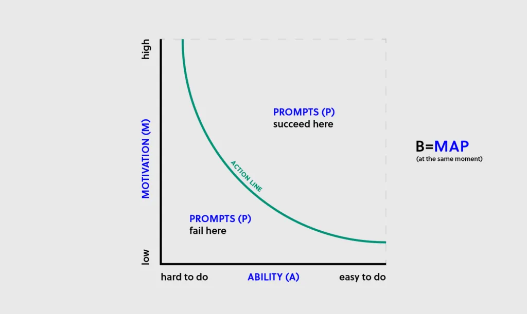
Although the chart might look complicated, the idea is actually quite simple. The model states that there are three factors influencing user behavior. These include:
- Motivation
- Ability
- Prompts
These concepts are hardly a novelty. Similar factors are present in other, much older, behavioral theories. The power of the Fogg Behavior Model is that it describes how these three come together.
In order for the behavior to take place, the user needs to:
- reach a certain level of motivation
- feel able to take action
- get a prompt
What’s more, the three factors can compensate each other. When the motivation is really high, the user can take action even though there is no prompt and it seems rather hard.
That’s it for the theoretical part. Now, let’s analyze a real-life example to see how this framework applies to UX writing.

The message you see above is a pop-up window from Asana, a popular project management tool. This short piece of copy introduces a new feature in the app. Let’s see how the Fogg Behavior model applies to it:
- Motivation – The message focuses on the main benefit. The feature will help the user focus on their important work – and this is exactly why they’re using Asana.
- Ability – The user knows what they’re supposed to do – add an inbox filter. The pop-up is displayed right next to available filters.
- Prompt – The information appears in the form of a pop-up. It creates a sense of urgency and encourages the user to take action.
As you can see, FBM is a simple and handy framework to use when working on UX copy. It will help you construct short, actionable messages that will encourage the right behaviors and guide your user through the product.
And here comes another question: how long should the messages be? Cognitive psychology has the answers you’re looking for.
Cognitive psychology in UX writing
Instead of focusing on behavior alone, cognitive psychology addresses attention, memory, thinking, as well as perception and language. The last two fields are particularly interesting for UX writers. Here are some of the findings you can use in your day-to-day work:
Perception of text
If you’re only going to read one book about UX writing, Strategic Writing for UX is the right pick. The author, Torrey Podmajersky, shares a lot of actionable tips that are rooted in cognitive psychology.
For instance, Torrey suggests that a single line of English text in an app should not be longer than 40 characters, which is usually three to six words. In the case of larger chunks of text, three lines make an optimal length. When a paragraph is longer, people refer to it as a “wall of text”.
As soon as a writer starts applying these rules, the user will feel more confident and capable of using the product. This goes in line with the Fogg Behavior Model we’ve discussed above.
Memory limitations
Have you ever heard of the Magical Number Seven, Plus or Minus Two? This is the title of a classic, widely cited academic paper written by George Miller. It has laid the foundations for Miller’s law, which states that people are able to hold between 5 and 9 items in their working memory.
It’s a handy point of reference, yet it doesn’t mean that you need to limit the number of items in the interface to just 7 items. The range of numbers is just a suggestion and the actual capacity may vary depending on circumstances and individual differences.
You can try dividing the information into smaller chunks instead, like you normally do it with phone numbers. It’s easier to remember three chunks consisting of 3 numbers than 9 numbers at once, isn’t it?
Same rules apply to information architecture, UX design, and interface copy. Have a look at this example from the landing page of Mailchimp:

The text is divided into smaller parts, yet there’s much more to this design. To avoid clutter, the content design team decided to use progressive disclosure. The interface indicates that you can expand a section to read more when you’re interested in, let’s say, startups or the restaurant business.
UX content heuristics
If you’ve been working in the UX field for quite a while now, it’s more than likely that you’re familiar with usability heuristics. This list of canonic rules was first created by the Nielsen Norman Group, an acclaimed UX research institute. Let’s see how they apply to UX writing:
Visibility of system status
As we’ve already mentioned, UX copy is supposed to guide the user through the product and tell them what’s going on. This is crucial from the moment they start using a digital product. At first, they’re faced with a tabula rasa, an app that needs data to start working. This is why empty state messages are important, like in this example from LiveSession:

Before the user starts recording website visitors, they need to connect their website. The profile is technically empty, yet it could also mean that something is not working. The empty state text ensures the user that everything is fine and suggests what they should do to get started.
Consistency and standards
Useful UX copy should above all be consistent. Imagine that at one point you’re asked to sign in, and then you find out that your login details are incorrect. You might click a modify button and see a pop-up asking you if you want to change this.
This is why all UX writing processes should start with an in-depth audit and agreeing on consistent terminology throughout the product. The sooner you get it all sorted, the easier it will be to maintain clarity later. Trust me on this one!
Error prevention
Avoiding errors creates a much smoother user experience than trying to fix them later. Here’s how Slack tackles it in their settings:
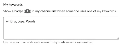
Instead of displaying an error message when someone doesn’t use commas, or including this information in the help center, Slack provides clear guidance through microcopy. A similar strategy can be applied in the registration process:
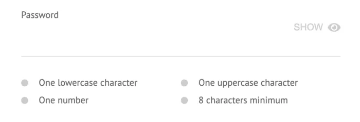
When you set up a password in DataFeedWatch, you already know what needs to be included. This way, the users avoid annoying error messages and they’re more likely to get it right at first try.
Bonus: your own limitations
Of course, the rules described above apply to designers too. Apart from them, we’re also affected by many other psychological phenomena. Perhaps the most important one of all is the curse of knowledge.
While you’re good with words, your users don’t have to be. Using fancy words, puns and metaphors in your UX content may appear witty to your and your colleagues – and incomprehensible to your users. Don’t forget edge cases, too – for instance, users on the autism spectrum often don’t understand metaphors at all.
Remember that most of the time, you’re not the end user. This is why it pays off to focus on plain language that will serve a wider audience coming from different backgrounds.
If you’d like to read even more actionable tips for better writing, you’re sure to enjoy this article about UI writing on the UXPin blog. I hope that this little psychology lesson has left you inspired!

