Adaptive Versions
Note
Adaptive Versions are only available in accounts created before UXPin 2.5 released on May 19, 2020.
An adaptive version is the defined browser’s width that allows for different layouts to appear when the browser is within the declared width. You can a custom adaptive version or choose one of the predefined Adaptive versions:
Web
- HD websites 1920 px
- Wide websites 1440 px
- Standard websites 1024 px
iOS
- iPhone 15 Pro Max 430 x 932 px
- iPhone 15 Pro 393 x 852 px
- iPhone 14 Plus 428 x 926 px
- iPhone 14 390 x 844 px
- iPhone 13 mini 375 x 812 px
- iPhone 8 375 x 667 px
- iPhone 8 Plus 414 x 736 px
- iPhone SE 320 x 568 px
- iPad 768×1024 px
- iPad Pro 10.5” 834 x 1112 px
- iPad Pro 11” 834 x 1194 px
- iPad Pro 12.9” 1024 X 1366 px
- Apple Watch 42mm 312 x 390 px
- Apple Watch 44mm 368 x 448 px
- Apple TV 1920 x 1080 px
Android
- Galaxy S22 360 x 780 px
- Galaxy S21 Ultra 412 x 915 px
- Galaxy S9 360 x 740
- Galaxy S7 360×640 px
- Pixel 5 393 x 851 px
Adding Adaptive Versions
To add an Adaptive Version to your design, follow the steps below.
Note
Remember that if you add an Adaptive Version, you will not be able to change the Canvas size for each Page later. This is because different page sizes and Adaptive Versions are alternatives to each other. That means, if your Prototype has or had an Adaptive Version, even if you deleted it – you cannot use different page sizes.
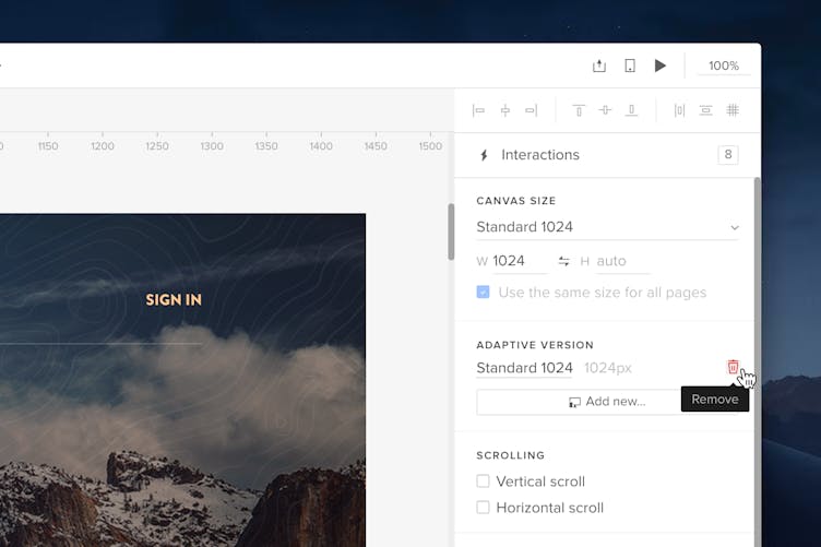
- Click Add new... in the Adaptive Version section of the Properties Panel.
- A window will show up. Confirm that you want to proceed by clicking the Use adaptive versions button.
- Next, on the Canvas Properties window, choose the Canvas Dimensions from the dropdown. Or, enter the height and width manually.
- Name your Adaptive Version.
- Confirm with Add adaptive version.
If you want to enable different canvas sizes in the current Prototype, follow the steps below:
- In the Properties Panel, uncheck the Use the same for all pages checkbox.
- A window will show up to informing you about the changes. Confirm by clicking the Use different sizes button.
- You can now set the size of your canvas separately for each Page in the Canvas Size section of the Properties Panel.
Copying Elements Between Versions
If you want to add another adaptive version, there's an option to copy all elements from an already existing version when adding it to your design.
- On the Canvas Properties window, check the checkbox I want to copy all elements from.
- choose the adaptive version you want to copy your content from in the dropdown.
- Confirm with Add adaptive version.
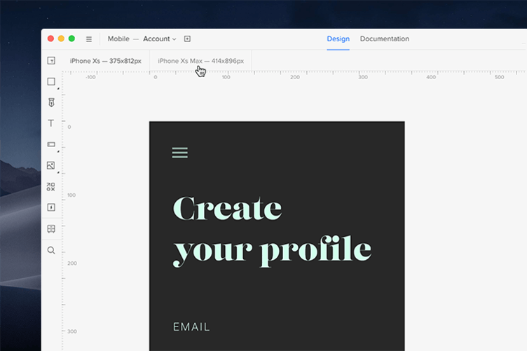
All elements will appear in the new Adaptive Version. However, their size will not be adjusted to the new one yet — resize them manually to fit the canvas. Every new adaptive version will have a tab right above the canvas and you can switch between them.
Previewing Adaptive Versions
Use the Preview mode to display and view designs together and see how they adapt to different screen resolutions. In the preview mode, you can switch between different resolutions in the drop-down list right next to the sitemap at the top left corner of the preview. The Auto set breakpoints mode is enabled by default and it helps to simulate how your design adapts to different browser sizes.

Previewing on Mobile
When designing for mobile it's best to install the UXPin Mirror on your iOS or Android device and scan the QR code directly from the Editor to open the prototype on your device.
If you don’t have a mobile device at hand, you can add a device frame to your prototype in the preview. In the Share menu, you can also choose whether to show the device frame when sharing a preview link.
Deleting Adaptive Versions
You can remove an adaptive version in its Properties Panel. You’ll see its name and a trash icon next to it.

Note
Deleting an adaptive version removes it from all pages of your prototype.