AI Component Creator
Note
AI Component Creator is currently in Beta and it is available only with the Tailwind CSS library.
AI Component Creator, powered by the OpenAI API, helps you speed up prototyping and streamline component creation with minimal effort. Whether crafting dynamic interfaces or exploring design concepts, this feature simplifies your workflow. Here’s how:
- Prompt-Based Design: Just input a prompt describing what you need, and the AI takes care of the rest, instantly generating a customized component for your prototype.
- Time-Saving: Say goodbye to manual design work. This tool cuts down the hours you'd spend crafting components, so you can focus on the bigger picture.
- Customization: The AI Component Creator tailors components to fit your project's specific requirements while allowing customization across every aspect of the component.
The AI Component Creator is especially useful for:
- Designers or UI Developers who need to create prototypes quickly and efficiently.
- Individuals who may lack extensive design experience but require custom components for their projects.
- Teams looking to minimize repetitive design tasks and focus on broader project goals.
How to generate components
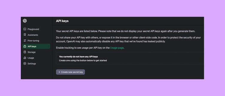
- Get an OpenAI API Key from the OpenAI website.
- Go to Editor and open AI Component Creator from the Quick Tools panel.
- Open the Settings tab and paste the API Key you got in the 'OpenAI API Key' field.
- Open the Prompt tab and generate customized components.

Tips and Tricks
- Be specific with your prompts: To get the best results from the AI Component Creator, provide clear and detailed prompts including specific design requirements, such as colors, typography, and layout preferences. The more specific you are about the characteristics and functionality of the component you're looking to create, the more accurate the AI-generated results will be.
For example: Create an input field with the label 'Email' positioned above it. The label should have a font size of 16px and be bold. The input field should have a bottom border of 2px solid, and a blue border when focused. - Experiment with different prompts: Don't be afraid to experiment with different prompts to explore the full potential of the AI Component Creator. Try out different combinations of words and phrases to see how they affect the generated components and discover new possibilities for your prototypes.
- Provide multiple instructions separately: Break down complex UI components into smaller, more manageable parts, and provide instructions for each component individually. This can help generate components with greater detail and accuracy.
- Iterate and refine Generated Components: While the AI Component Creator can save you time by automatically generating components, it's important to review the results and make any necessary refinements. If the initial output is not as expected, experiment with different wording, structures, or additional details until you achieve the desired outcome.
Example Prompts
Note
The performance of the AI Component Creator depends on the performance of the OpenAI platform. Please keep in mind that longer prompts might result in slower generation times.
- Create a testimonial card with a 5-star rating. The testimonial should be in quotes. Its copy should be ‘The best tool I've ever used’ and 5 out of 5 stars should be active. Use #FFD700 for stars and #636363 for text. Add a label 'Long-time customer’.
- Create a navbar navigation with the following specifications:
Gradient background with shades of blue and pink. Place the store name on the left side, using uppercase letters and without a logo. Center-align menu items within the navigation. Add a 'Login' button on the right side with a hover effect.
- Create a sign-up form layout with testimonials displayed on the left side, featuring a dark color scheme. For the form container use bg-gray-900 and text-white. Use input fields with rounded corners and border-gray-700. Include placeholders in the inputs. The submit button should be bg-blue-500 and rounded corners. For the testimonials section use bg-gray-800 to visually separate the testimonials from the form. Apply text-white, text-lg, and font-semibold for testimonial quotes.
- Persona card with a profile picture of the person on the left side. Avatar should be rounded. Display the person's name in bold font at the top. Provide details such as age, occupation, and location beneath the name. Include a brief description or bio about the person's background and interests. Add icons or visual indicators to represent key attributes or characteristics. Ensure the card has a visually appealing layout with sufficient spacing and alignment.
- Design a hero section for a website with a large background image. Overlay the background image with a semi-transparent color to enhance readability of the text. Include a concise and compelling headline that conveys the website's value proposition and a paragraph with the main message. Add a large call-to-action button 'Get Started' at the center.
- Create a pricing table with three columns representing different pricing tiers.
Column 1: Pricing plan for freelancers priced at $19.
Column 2: Pricing plan for startups priced at $39.
Column 3: Pricing plan for companies priced at $59, with this column highlighted and labeled as 'Most Popular.'
Under the table add information to 'Contact us' to get the Enterprise plan.
- Generate a horizontal footer for the clothing store without images. For background use gray-800.