Today’s product experiences are becoming blazing fast.
We expect speed. We demand no more than a few minutes for Uber car arrivals, same-day deliveries from Amazon, instant upload time of huge images on Facebook and not a single millisecond of buffering when watching a Youtube video.
Our experiences require speed of use.
Speed of use is a usability trait describing the minimal timeframe in which users accomplish a given task. This includes the actions that lead to the task but also the time it takes users to recover from errors.
Speed of use, however, should not be confused with ease of use, which refers to how easy and intuitive an interface/flow/action is without external support. Both are important and should be treated harmoniously by overlapping their key components.
Here are 5 rules you should consider for improving speed of use.
Rule 1: Respect Fitts’s Law
Fitts’s law is a model of human movement for quantifying the difficulty of selecting a target.
First devised in 1954 by Paul Fitts, the law states that the time required to move to a target area is a function between the distance to the target and the size of the target. Basically, in terms of interaction design, the closer and larger the target area, the faster it is to reach it with a pointing object, be that the mouse pointer or the fingertip.
To support this statement, you should consider the following tips described in the free Interaction Design Best Practices Vol.1:
Create larger targets
Use slightly bigger buttons and enlarge the clickable area of your interactive elements to the maximum.
Do not exaggerate the overall size, though, because larger targets are effective up to a point, after which they hit a plateau and will only make users ignore other important elements on the page.

For example, Duolingo uses a very large button on the homepage that is easy to click.
Minimize pointer movement
Find the right balance between grouping elements by type and by usage patterns. Minimizing the distance between elements in a task flow will certainly increase the speed of use of your interface.

Duolingo, for example, includes large clickable cards with minimal distance between each card.
However, the opposite of Fitts’s law is a good method when trying to reduce user errors by adding space to separate items so they’re not accidentally clicked. In this way, we can actually add friction to minimize user mistakes.
For example, Salesforce IQ places the “Delete” function at the far right of a list of actions.

Avoid muscular tension
This law is especially relevant for mobile interaction design.
Because gestures consist of a temporary continuous movement, they require more muscular tension than simple point-and-click actions on a desktop.
Just like the previous rule, use gestures that involve more difficult movements for actions with more severe consequences, in order to avoid triggering unwanted commands.

For example, the Gmail mobile app uses the swipe right gesture to archive emails, an action that requires more muscular tension compared to a tap.
Exploit the prime pixels
Prime pixels are areas on the screen that are easier to reach.
For a desktop and laptop screen, prime pixels sit in the corners and edges (not applicable for web interfaces, though), while for a mobile device prime pixels are in the proximity of your thumb.
Still, for any device that uses a pointer, the fastest-to-reach pixel on the screen is the one you are already on, which is why contextual right-click menus were introduced.
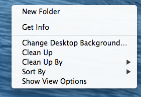
Photo credit: OSX
Rule 2: Respect the Hicks–Hyman law
The Hicks–Hyman law states that the more options you present to users, the more time it takes for them to reach a decision. When you focus the choices presented to users, you improve speed of use.
It’s important to note that the law applies mostly to items that are listed randomly, like menu items or product categories, which are often displayed based on their value for the user or the business, emphasizing the importance of a good taxonomy review and a solid information architecture.

For example, Stripe displays only two important buttons on the main pages.
Choice paralysis effect
The concept behind the Hicks–Hyman law is similar to a subsequent psychological effect named choice paralysis, first used by retail marketers and now adopted by designers.
In his book, The Paradox of Choice, American psychologist Barry Schwartz argues that reducing the number of choices offered to consumers also reduces the anxiety they face in the decisionmaking process.
Therefore, presenting less options to users will:
- Reduce the time the users need to make a decision in order to continue their journey.
- Reduce the mental discomfort caused by evaluating multiple items.
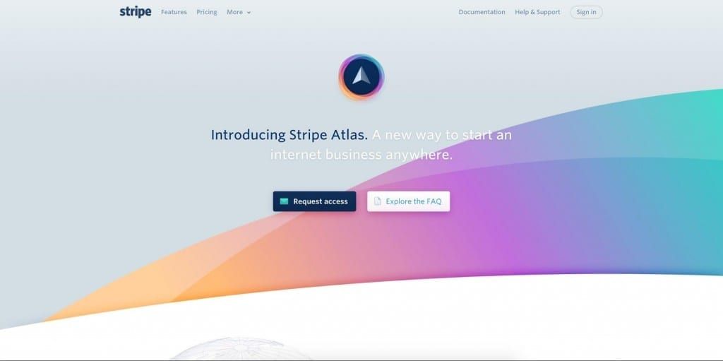
The top left menu on Stripe’s website also displays only the 2 most valuable pages, hiding the secondary options under a More button.
Rule #3: Optimize Text for Scanning
Two interesting studies were conducted by the Nielsen Norman Group to investigate the connection between text scanning and usability:
i. The first study showed that “concise, scannable and objective copywriting” improved usability by 124%
ii. The second study showed that “users will read about 20% of the text on an average web page”
Optimizing text for scanning requires 2 types of optimization: layout optimization and content optimization.
Layout optimization
Optimizing text for better scanning starts with choosing the appropriate layout for the project. As explained in Web UI Design for the Human Eye (Vol. 1), consider 3 main design layouts:
The Gutenberg diagram
The Gutenberg diagram is best used for text-heavy pages and it divides the layout into 4 quadrants:
1. Primary optical area, in the top/left
2. Strong fallow area, in the top/right
3. Weak fallow area, in the bottom/left
4. Terminal area, in the bottom/right
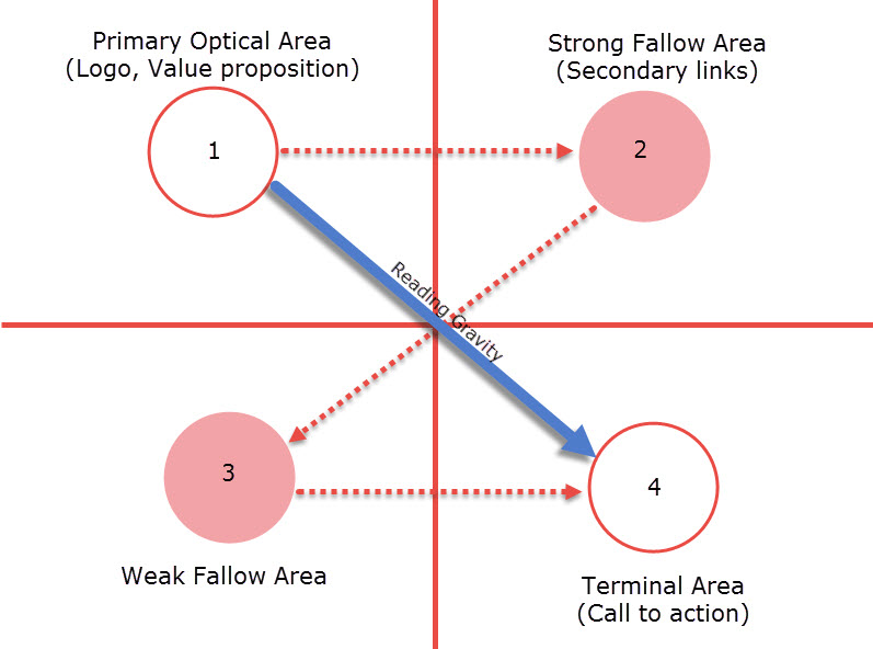
Photo credit: Vanseo Design
The Gutenberg diagram suggests that the main areas of interest are the top/left and bottom/right, as the eyes follow an axis of orientation called the reading gravity, meaning that the eyes don’t follow a straight line when scanning or skimming but “fall” from left to right.
The Z-pattern
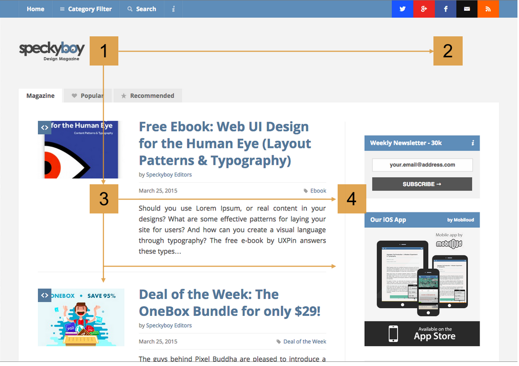
Follows the shape of the letter Z, so the eyes travel from top left to top right and then diagonally to bottom left and then bottom right. It’s recommended for simple web interfaces that contain less information.
When repeated, the Z-pattern leads to the Zig-Zag pattern that is mostly used for designs that have to present the content in the form of a story, like long one-page websites presenting a product.
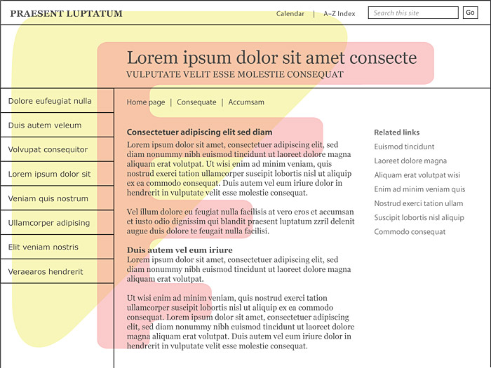
Photo credit: Web Style Guide
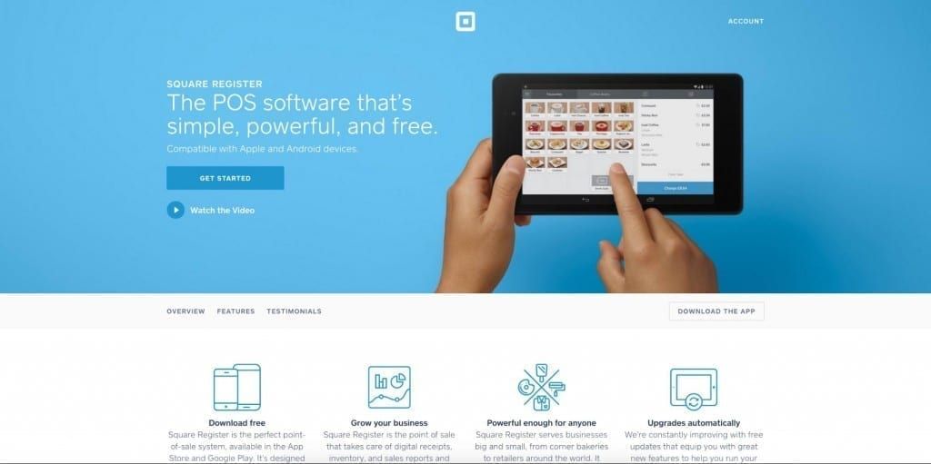
On Square’s homepage, you can see how they’ve optimized the pattern to communicate their core product value. The headline, trial CTA, and video CTA all sit within the Golden Triangle.
The F-pattern
Probably the most recognisable, the F-pattern is most obvious when analyzing the results of eye-tracking studies. The studies show that the eyes move from left to right at the top of the page, but as they go down, the horizontal movement decreases and the eyes stick closer and closer to the left edge.
As with the other patterns, the F-pattern suggests that the most important information should be placed at the top and left side of the page, so that they are the most visible when people scan the page. This means, for example, that the first paragraph should express the most valuable details, subtitles should start with information-heavy words and form fields should be aligned left.
Content optimization
After choosing the best layout, you should optimize the content within the page. More specifically:
- Text is presented as bulleted list when possible
- Subtitles should be short, explanatory and begin with relevant words
- Form fields should be aligned left
- Text should be divided by images or illustration to break long text into digestible paragraphs
- Using bold or font variation for important words
- Isolating sentence with the most valuable information
- Explaining only one idea per paragraph
- Starting with part of the conclusion to attract interest
- Cutting down the word count
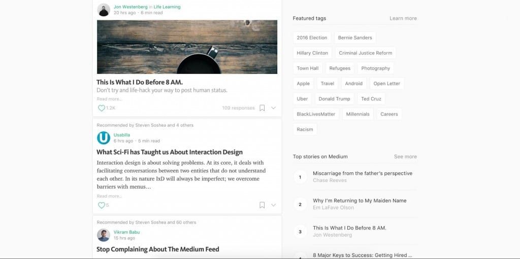
Medium aligns important content to the left and and uses different font colors, weights and sizes to make the text stand out.
Rule #4: Minimize Interstitial Anxiety
Interstitial anxiety describes the temporary state of tension users experience between the moment they trigger an action and the system gives a response. Delays are usually caused by slow loading times, laggy feedback and latency issues.
To minimize interstitial anxiety, we have to understand that there are two interconnected components that form interstitial anxiety: transitional and temporal anxiety.
1. Transitional anxiety
It’s the first step of the sequence and refers to the mental tension derived from the transition period to another screen or page.
This shift that takes the user from one type of interface design to another (like the steps of a checkout flow) must be seamless in order to maintain a continuous experience for the.
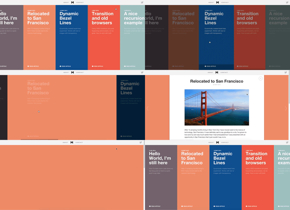
The best way to reduce transitional anxiety is to use subtle animations and transitions between screens like in the image below, helping users adjust gradually to the change between page states.
2. Temporal anxiety
It comes as a second step and describes the mental tension caused by the timeframe in which the accessed page is loading. This step comes after the users transition to a new page, when it usually takes some time to load the entire content.
In 2006 at Web 2.0 Conference, Marissa Mayer, still Google VP by then, presented a study showing that a 0.5 second delay in load time resulted in a 20% drop in traffic for Google’s search page.
There are a couple of methods to counter this issue, both of them focusing on delivering something visually interesting so users don’t need to stare at a blank screen:
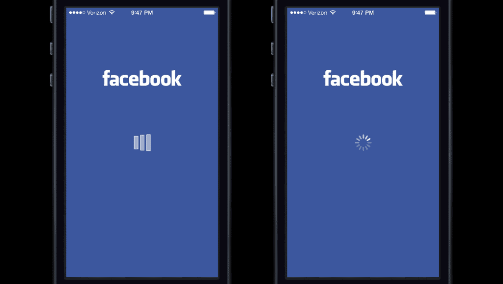
- Using a loading animation like a spinning wheel, loading bar, animated gif, animated copy etc. In an article about this subject, Rusty Mitchell talks about a Facebook test indicating that “when the users were presented with a custom loading animation in the Facebook iOS app (left) they blamed the app for the delay. But when users were shown the iOS system spinner (right), they were more likely to blame the system itself.”
- Using a placeholder animation simulating the actual content that will be loaded. Medium uses this trick, showing a simple image wireframe as a placeholder, while the actual image loads.

Rule #5: Use Universal Design Patterns
Ever since the web became mainstream, designers have faced all kinds of problems which demanded scalable solutions. Over the years, the most successful solutions have become patterns that users intuitively understand.
As explained in Web UI Patterns 2016 Vol 1., universal design patterns are reusable validated design solutions, acting like a common language between designers and users. Patterns work because people adjust their future behaviour based on past experiences.
Placing links on underlined texts or clicking the logo to go back to the homepage, are all design patterns that users find easy to use because they’ve grown so familiar to such conventions.
Even now, most patterns are still in a beta stage and designers constantly look for innovative alternatives. Yet, innovation that adds value to a design and innovation for the sake of being different, are separate things.
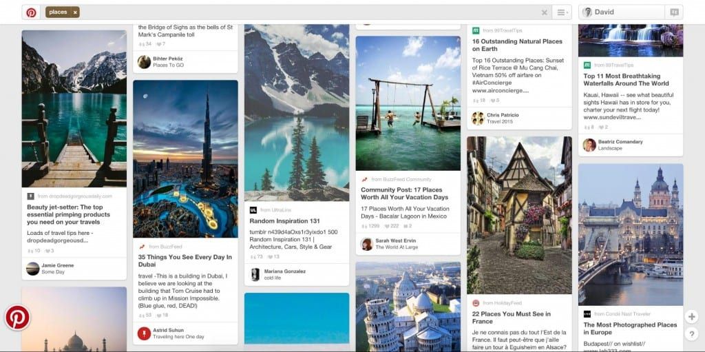
Pinterest is an example of innovative design, promoting a different type of image display layout.
Combining innovation with consistency is critical for a good user experience and good designers take into consideration both sides of it:
External consistency
Design patterns help create external consistency because they match user expectations (e.g. consistent with their experiences external to your design).
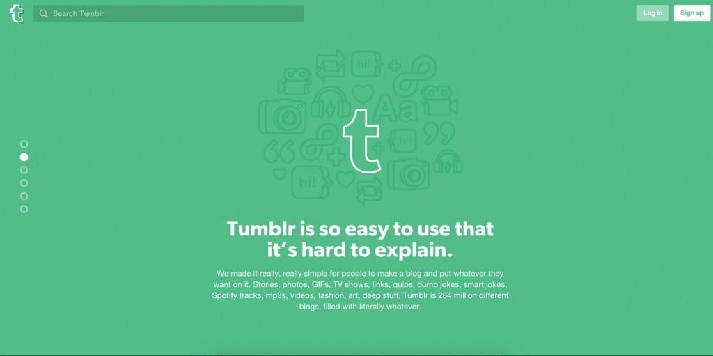
For example, Tumblr plays into external consistency by placing the Log in and Sign up button in the top right corner (as users would expect).
Internal consistency
Refers to using the same set of patterns inside each page of an interface, which is important for creating a seamless experience for multiple user flows. Internal inconsistency annoys users and makes the product feel unusable and unprofessional.
Within a product team, pattern libraries ensure internal consistency since they document and recommend best practices for an entire design system.

For example, Twitter maintains internal consistency by using the same color for interactive elements like links and buttons.
Final Thoughts
Speed of use is a key characteristic of all great products.
Mental models try to identify and eliminate mental blockers, user journeys are optimized to require as few steps as possible and information is prioritized so users find what they want as fast as possible. As a result, every step of the experience is ultimately designed to respect the user’s time.
So, whenever you’re designing a project, keep in mind these 5 rules for improving speed of use:
- Respect Fitts’s law by creating larger targets and minimizing pointer movement
- Respect Hicks–Hyman law by reducing the number of choices offered to users
- Optimize text for scanning by choosing a suitable layout and by formatting content
- Minimize interstitial anxiety by using transitions that eliminate experience delays
- Use universal design patterns by taking advantage of common user behavior for better internal and external consistency.
For more practical UX advice, check out the free guide Interaction Design Best Practices (Vol.1) below.


