The Guide to Lightweight UX Documentation

UX documentation is a crucial part of the UX design process. It serves as a reference, giving context to the product’s lifespan from the initial concept to the current iteration.
Good UX documentation is detailed yet lean. It should be highly focused, actionable, and purposeful.
UXPin lets you store UX documentation, prototypes, design systems, and style guides all in one place. Discover the world’s most advanced UX design tool. Try UXPin for 14 days.
What is UX Documentation, and Why is it so Important?
UX documentation is a working document of a product’s journey from inception to the current release. This documentation is essential for several reasons:
- Organizational memory—serves as a historical reference for user experience design decisions, workflows, research, and other processes teams have tried, including what’s worked and what hasn’t. UX documentation can prevent teams from making the same mistakes or exploring avenues others have already tried.
- Onboarding & handovers—UX documentation is helpful when onboarding new team members or handing a product off to a new team. If the product or company is acquired, UX documentation will help facilitate a faster, smoother asset transfer.
- Single source of truth—a single reference means every team and department knows a product’s history and how it got to where it is. No person or department can distort the facts to push an agenda or retry something that’s failed.
- Fosters better communication & collaboration—effective design documentation allows every stakeholder to read about the UX design process and how the product has evolved.
- A valuable R&D and IP—good UX documentation is a valuable intellectual property asset describing a product’s research and development. This asset can help develop future products or increase a product’s value when it comes time to sell.
What to Include in UX Documentation
What to include and how to create UX documentation will depend on your product, industry, company, research, and design processes.
Here are several elements of the user experience design process you must consider when compiling your docs.
- Introduction
- User Research
- Initial Concepts & Sketches
- Information Architecture
- Wireframes & Mockups
- Prototypes
- Usability Testing Reports
- Design System
Introduction
The introduction or brief should summarize your UX documentation and include the project’s goals, objectives, and vision. Your introduction must be easy to digest and understand for all stakeholders (including non-designers) who may not want to delve into the granular design details.
User Research
User research is an essential part of any UX research document, including user personas, empathy maps, user journey maps, interviews, market research, and any other information that pertains to the customer.
User research is one part of UX documentation where you can afford to include all the information you have to avoid speculation, guesswork, or misinterpretation of the results.
Initial Concepts & Sketches
Including a summary of initial concepts and sketches can help teams understand how the product’s journey began and the thought processes behind the product’s features.
You can also include sprints and brainstorming sessions reports to understand how various teams have solved user and design issues.
Information Architecture
Information architecture is an essential piece of UX documentation because it gives a bird’s-eye view of a product, navigation, and user flows. You can also include the architecture’s changelog so readers can see how the product has grown and evolved.
Wireframes & Mockups
Static wireframes and mockups allow stakeholders to inspect each screen to understand the product’s details. Wireframes provide context for the structure and hierarchy of each screen, while mockups highlight colors, typography, iconography, branding, and other visual elements.
Prototypes
Prototypes allow stakeholders to explore the product and understand the context behind usability testing and design concepts. Your UX documentation should only include the latest iteration rather than every prototype you’ve ever created!
UXPin is the world’s most advanced code-based design and prototyping tool. Provide a link in your UX documentation to the latest product prototype. In UXPin’s Preview and Share mode, stakeholders can interact with the prototype like the final product.
Team members can use Spec Mode to inspect properties (size, color, grid, typography), measure distances, and open the product’s style guide (design system).
Ready to explore UXPin’s powerful prototyping functionality? Sign up for a 14-day free trial today!
Usability Testing Reports
Usability reports document the process and results of testing. It’s important to define a standardized reporting process as early as possible so your UX documentation is thorough and consistent.
Your docs should also outline the company’s usability testing process and reporting policies, so research teams maintain a high degree of quality and consistency.
Design System
Your design system or style guide outlines the product’s design patterns, fonts, colors, components, hierarchy, spacing, and other visual design standards. The style guide will also include guidelines and correct usage to maintain a single source of truth across the entire organization.
UXPin solves the single source of truth dilemma with Merge technology. Product designers, UX teams, and developers use the same design system components synced from a repo to UXPin’s design editor.
Read more about UXPin Merge, how it reshaped PayPal’s DesignOps workflow, and reduced time to market.
3 Tips to Create Great UX Documentation
These are three tips to improve your UX documentation from Yona Gidalevitz at Codal (an enterprise design and development agency).
Yona says you must ask two crucial questions about the UX documentation you generate:
- Is the UX documentation going to drive decision-making?
- Is your UX documentation usable to your team?
Give your UX documentation purpose by determining how it drives decision-making
Fact: UX documentation has a purpose if it drives decisions.
UX documentation has a wide variety of end-users—including designers, developers, QA specialists, stakeholders, and management—all of whom may (or may not) use a particular document to make informed decisions during their work.
In fact, any given document can impact decisions.
Let’s consider the Agile software development lifecycle (SDLC) for a moment. One document may impact a particular activity in the SDLC, while another document may affect several subsequent activities.
For this reason, it’s imperative to consider the lifecycle of the document. The lifecycle of a document refers to the path, from user to user, before it is no longer needed. It’s a matter of ROI.
In general—and there are exceptions—the longer a document remains relevant during the SDLC, the greater the return on time spent perfecting it. The reason for this ROI is because these documents drive decision-making across multiple stages.
In other words, UX specialists need only make documentation when it is necessary. Otherwise, you’re wasting time and money—not only creating it but for those who must consume it!
You may be wondering, but how do I determine the lifecycle of a document before I’ve even made it?
Determining the lifecycle of a document is as simple as looking at its various use cases.
For example, take the following empathy map Codal created for one of its clients.
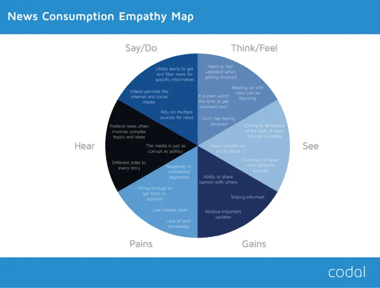
UX specialists know that UX research documents tend to make great decision-making tools.
Let’s investigate the lifecycle of the empathy map above. To do so, we need to consider who is likely to use the document and for what? In Codal’s case, the document is a compilation of user research results.
User research results drive the entire product strategy during the SDLC. Even if developers and PMs don’t own the document, its insights will inevitably influence their work.
If we follow the logic presented earlier, an empathy map is an investment for the product’s future. Creating UX documentation as early as possible increases the ROI over time.
Make your UX documentation useful by meeting the requirements of the target audience.
Fact: a document can drive decision-making yet still be useless at the same time.
Developers don’t always have an equal say in page layouts—they usually follow the designs created by the UX & UI designers. Thus, the design documentation, however poor it may be, will drive development decisions.
In other words, “driving decisions” is one concept, and “driving good decisions” is something else altogether.
Documentation with a purpose and a target audience is likely to help stimulate good decision-making among targeted users.
The converse is also true.
Documentation that doesn’t consider the audience’s specific requirements might miscommunicate the UX specialist’s intentions.
Avoiding the pitfalls of non-targeted documentation is simple:
- Deduce the target user-base.
- Analyze how teams will use the document.
- Craft the document so that it speaks the language of the user.
Consider the following interactive wireframe.
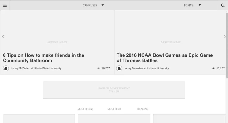
We can determine the target users of any document by examining its purpose.
Static wireframes are typically used as visual scaffolds so that the interface designer may craft a pixel-perfect mockup of the UX designer’s vision.
Interactive wireframes, however, can also be used by developers to gauge dependencies and interaction models. Product managers can also quickly assess the feature breadth (horizontal requirements) and depth (vertical requirements). QA specialists may even use the interactive wireframe to double-check the developer’s work to recreate functionality.
As such, we can deduce that the target audience for an interactive wireframe includes:
- UI designers
- Product managers
- Web / mobile developers
- QA Specialists
To ensure that the document is helpful, it must cater to the specific needs of each target audience above. Otherwise, our document is effectively useless.
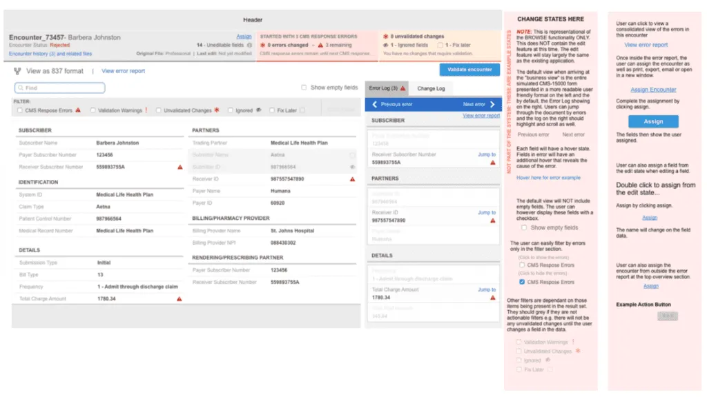
Here’s how LookThink tailored its document to each audience created in UXPin:
- To help UI designers – Estimate image and layout dimensions.
- To help product managers – Note any “wobbler” features that may provide additional value but exceed the current scope.
- To help developers – Add notes to clarify complex functionality and ask for input on feasibility.
- To help QA specialists – Note which functionality is up for discussion and which the team accepts.
Improve documentation usability by keeping it focused.
Fact: documentation depends heavily on usability.
No matter how good documentation’s content is, it’s useless if readers can’t understand it. We can distill document usability down to one word: focus.
Often, UX specialists overwhelm UX documentation with too much information. This information overload can cause many problems, especially when the data gets lost in translation.
Human beings don’t like to read extraneous details. How many times in your life have you been thrilled to read a 20-30 page document? UX documentation must be focused.
Let’s look at the following sitemap, created by Codal for a client’s project.
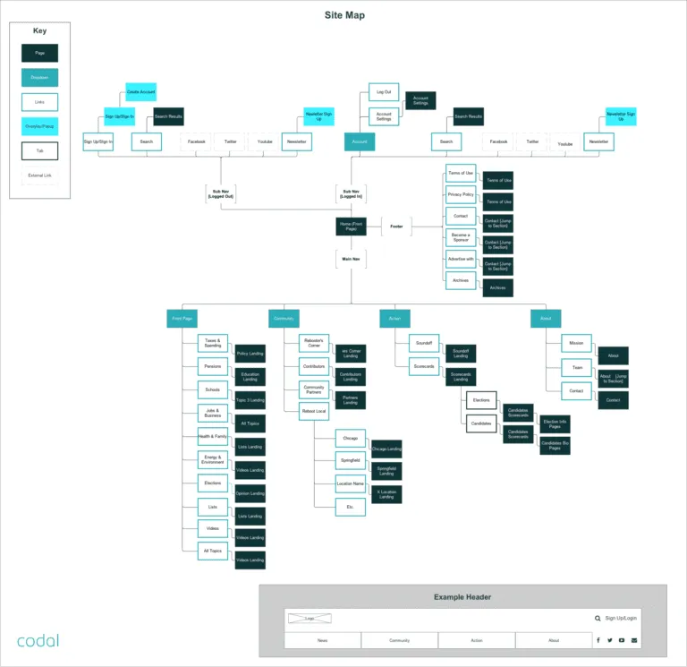
This document is a fantastic example of focus.
Codal confined everything to one page with no extraneous details or excessive notes. The target audience only has to consume highly relevant data—nothing more, nothing less!
Achieving focus in UX documentation is simply applying the core principles of purpose and usefulness. The above document illustrates this point effectively.
UI designers and developers don’t need to hear every reason behind the choices you’ve made. Save it for an in-person discussion or only highlight the top 3-5 decisions.
There are exceptions, of course. For example, the QA team might require detailed reasons to test the software’s functionality adequately. It’s important to liaise with each department to learn what information is essential and what is redundant.
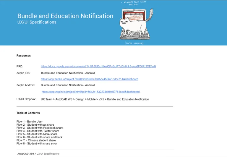
Bonus Tip: Create a documentation hub that links out to all relevant documents
As Autodesk shows below in UXPin, include explanatory notes in the hub rather than clutter the actual decision-making documents.
Improve UX Documentation With UXPin
UXPin lets you add documentation directly to your product’s prototypes allowing you to maintain a centralized reference within the design tool.
This centralized documentation fosters better communication and collaboration between product designers, UX teams, and developers to keep everyone on the same page.
Why not try UXPin for your next project? Discover how UXPin can enhance product design, streamline workflows, and improve team collaboration. Sign up for a 14-day free trial.


