How to Design a Product in 5 Steps

The quality of design is about more than offering a visually-appealing interface; it has a direct impact on the product’s commercial success. According to McKinsey & Company, using design thinking methods leads to a 35% increase in revenue. It also prompts a 56% increase in return compared to businesses that put product design in the back seat. But what does it take to get product design “right”? This is what we’re going to cover in this part.
Release products 10x faster with powerful design technology – UXPin Merge which makes it easy for designers to prototype with ready-made UI components that are fully interactive. Discover UXPin Merge.
How to Design a Product? – 5 Steps of Product Design
Irrespective of your design process, you must ensure it circles around usability. Below are the five steps of product design that you should follow as you roll out solutions.
Bear in mind that – while it’s divided into stages – design isn’t an iterative process, so you engage in all of these actions on an ongoing basis as you refine your product.
Step 1: Empathize
Showing empathy is the first and, arguably, most crucial step of product design. It requires a deep understanding of your users, their experiences, and their needs. Essentially, you and the design team set aside your own assumptions and personal biases.
There are plenty of methods you can use to learn about your target users. For instance, you can collect qualitative data directly by asking them questions in surveys or interviews. Alternatively, you can decide to ‘sit back’ and observe how users interact with the product or service uninterrupted, in their natural environment. This can be done through unmoderated usability tests.

What to do if you’re designing for a group of users who seem inaccessible? Talk to experts in the field who can help you better understand the most common needs and problems in the niche. It’s not uncommon for designers to pair up with psychologists, sociologists, or even anthropologists. By doing so, you learn about the social and cultural background of the users, making your solution even more user-friendly.
Useful Tools and Resources:
- Learn about desirability, feasibility, and viability.
- Learn about UX research.
- Learn the business value of design.
Step 2: Define
The second step in learning how to design a product is creating a clear problem statement. At this stage, you use the insights gathered during the ‘Empathize’ phase and define the challenges you seek to solve with your product.
The statement needs to be:
- Human-centered. Focus on the user’s perspective, emphasizing their needs and goals. The statement should resonate with the target user.
- Balances between specificity and flexibility. While it should be specific enough to provide guidance, it must also guarantee enough flexibility to encourage creativity and innovative solutions. This helps designers have a clear direction without constraining their ability to generate ideas.
Problem statements can be short or take on a descriptive form. Some teams use the Point of View Madlib, which is a sentence that follows the template:
[User X] needs to/does [explanation of the action] because [the insight].
Others use 2-4 sentences to define the challenge and any unique circumstances.
Here are some examples of well-defined problem statements:
- We’re seeing an unexpected increase in people abandoning the signup process. Customers say that they’re frustrated with the number of forms they need to fill in to create an account. We need to streamline the sign-up process.
- New customers say that they can’t understand our pricing scheme without asking customer support for help. The “pricing” page has a significant bounce rate because they don’t know how to easily compare features between tiers.
- Streaming platform users say that they are missing a filtering option or – if it exists – they can’t find it. They can’t eliminate movies that have an IMDb score lower than 7/10 and have to check each rating movie by movie, on their phones.
So, the Define step of product design zeroes in on a specific, user-centric issue statement. When designers grasp the issue they’re trying to solve, they’re more likely to create a solution that helps people.
Useful Tools and Resources:
Step 3: Ideate
Ideation, the third step in product design, inspires new ideas. The prior two stages—empathizing and defining—provide a solid basis for this phase. With this information, designers can question preconceptions and explore alternate problem-solving techniques.
Sketching facilitates this process, allowing designers to visualize ideas and iterate on concepts.
It’s a good idea to turn to techniques like Google’s Crazy 8s and the 4-step Sketch exercise. They set time limits for each brainstorming session, which boosts your team’s focus (and, ultimately, productivity).

After developing ideas and exploring them, you start eliminating those that aren’t viable. By the end, you’ll agree on the one idea to proceed with next.
Next, you frame it as a user story. It’s quite similar to the previously mentioned Madlib problem statement, and follows the template below:
As a [user], I want to do [X], so that [Y].
For example:
“As a customer, I want to pay through the app, so that I don’t have to reach for my credit card every time I complete an order”.
It helps articulate the goal and defines an actionable task. Knowing the ‘what’, designers can now focus on the ‘how’.
As you can see, designing a successful product comes up to a lot of preliminary research, way before you create the first wireframe. The product design process lets you discover industry-changing breakthroughs by challenging the status quo. Tried-and-true methods like user stories help design teams create a clear roadmap for the prototyping step, discussed next.
Useful Tools and Resources:
Step 4: Prototype
In the product design process, the prototyping stage helps turn ideas into the first tangible, testable collateral. By developing scaled-down prototypes, design teams can check potential solutions and identify any limitations or problems the product might face. This step ensures the end product meets user expectations.
Prototyping can be divided into two types: low-fidelity and high-fidelity.
Low-Fidelity Prototypes
Low-fidelity prototypes are simple, hand-drawn, or basic digital wireframes without color or content. They enable UX teams to visualize screen layouts, test navigation, and assess user flows. For example, a typical eCommerce checkout flow with a cart, delivery, and payment module can be represented as a low-fidelity prototype.
According to the Nielsen Norman Group, low-fidelity prototyping helps designers iterate faster and facilitates stakeholder buy-in. Also, it encourages a focus on functionality rather than aesthetics.
High-Fidelity Prototypes
High-fidelity prototypes incorporate color, content, interactions, transitions, and animations. This assists in creating a more immersive user experience. In essence, they closely resemble the final product. And since they’re more relatable to users and stakeholders, they’re also likely to make the design feedback you collect more valuable.
What’s more, high-fidelity prototypes are great at pointing out usability issues. Remember that they might be missed or unaccounted for in low-fidelity versions.
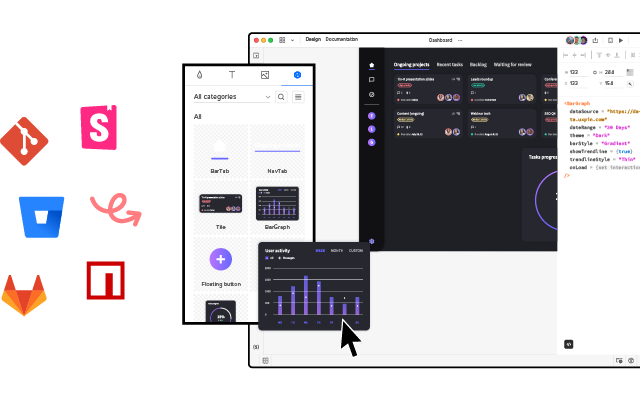
One powerful tool for creating high-fidelity prototypes is UXPin Merge. It enables designers to work with coded UI components, which can be imported from Storybook, NPM, or Git repositories. Using UXPin Merge, even small design teams can create life-like prototypes that adhere to design system guidelines. The imported components look and function like those in the final product, which helps streamline the prototyping process.
Useful Tools and Resources:
Step 5: Test
The fifth and last step in successful product design is the testing phase. Designers or evaluators rigorously assess the efficacy and viability of the product. This stage is a key ingredient of iterative design thinking, letting designers spot problems and brainstorm how to refine them.
The main goal of the testing phase is to determine how well the prototype solves the identified issue. It doesn’t involve implementing or synthesizing research. Instead, the focus lies on employing the most appropriate research methods. These approaches help gather detailed feedback, insights, and document findings.

While various usability testing methods exist, they can be roughly narrowed down to two categories:
- Moderated tests. These involve direct interactions between the facilitator and the participant. Users are asked to complete a task, like downloading a PDF report from the user panel. They might either be asked to comment on what they’re doing at each step, or asked questions by the facilitator.
- Unmoderated tests. These exclude the facilitator’s presence, but the participants still get a list of instructions they are to follow.
The good news is that usability testing doesn’t require a large investment. According to Jakob Nielsen of the Nielsen Norman Group, you can spot as many as 85% of all issues by testing with just five users!
Better yet, evaulating your product design doesn’t have to be limited to structured usability testing sessions. You can also do so asynchronously, for instance, by sharing a prototype and asking users and stakeholders to comment directly on the design.
They can place a pin on any elements that they want to comment or ask about. This makes it easy for users to comment either on the overall user experience and product ‘feel’, or zero-in on details like buttons or images.
This is possible with a tool like UXPin, which lets you design and collect specific user feedback directly on the prototype. This means fewer errors in the final product.
Useful Tools and Resources:
- Learn how to run insightful usability testing
- Learn how you can use fully functional prototypes in usability testing
Getting the Product Design Process Right
There isn’t a single, one-size-fits-all answer to the question of how to design a product. Each product enters the market at a different time, and its target users have their own, unique challenges and goals. Still, regardless of any external factors, the key lies in following a well-thought-out product design process.
Creating the right solution is about diving deep into the needs and emotions of your users. Before you create a first wireframe – even the most simple one – it’s important that you clearly define your users’ goals and know how to best serve them.
Also, remember that product design is a collaborative process. A large part of your success depends on whether your fellow team members – designers, product managers, and developers alike – can all work towards the same objective. Here’s where using prototyping tools like UXPin will do wonders, allowing you to design, collect feedback, and handle developer handoffs all with a single tool.
Powering UXPin with its Merge technology will speed up prototyping for you for about ten fold. Why? It makes it simple to bring your dev’s component library to UXPin and build prototypes that are fully interactive and easily translated to code. Discover UXPin Merge.


