A year ago I started working as a Senior UX Designer at BlazeMeter, a testing platform under Broadcom’s Enterprise Software Division. The core application of BlazeMeter is the performance testing section which allows teams to test products by simulating thousands or millions of virtual users (VUs) that interact with their site from different locations and combining it with the user interface and functional tests.
In every demo of BlazeMeter performance testing, you will see the “Booting screen” that follows the Test Configuration screen. As stated above, some tests simulate up to millions of VUs so the booting screen will need to be able to contain a large amount of information in a simple and accessible way. The problem was that at the time I came to the team, the booting screen was a relic of the old version of the product that aimed to a much lighter test profile.
My first major task was to design this new awesome simple-to-use booting screen.
The process
After an amazing 3-day Design Sprint workshop with an incredible and supportive team, I sat down at my desk (boy, it was a relief after standing the whole design sprint) and stared at the whiteboards with all that drawing in half working markers that were supposed to be the solution storyboard. The team has already solved most of the major issues in a very satisfying manner but one challenge was still unsolved - the booting progress bar.
The Challenge
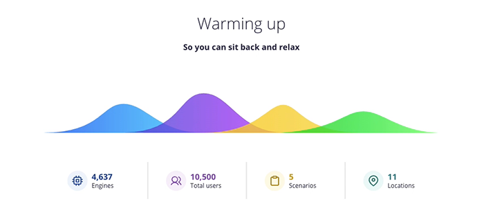
The progress of a performance-test is not linear, it is made up of statuses, such as “pending”, “booting”, “downloading”, and “ready” that are displayed on the screen at the same time at a different pace. So you can’t present it with the same ol’ progress bar or a spinning loader.

“I wanted to present the concept of statuses with waves – moving, dynamic and changing all the time in a non-linear way. UXPin turned out to be the perfect tool to prototype such a concept!”
Nitzan Ron, Senior User Experience Designer,
Solutions
The first solution that came to my mind was a dynamic pie chart. But after experimenting with it for a while, I came to realize that it would be very hard to read in some cases. The second idea was to use a regular vertical chart, but it turned out to be boring as hell. I remember asking myself what if instead of vertical columns in a chart I would present different statuses as waves that would dynamically change all the time?
How I solved the problem using UXPin
For those of you that are not familiar with it yet, - UXPin is a cloud-based design and prototyping tool to create life-like animated prototypes without the need to use 3rd party tools or duplicate artboards/frames as most similar applications do.
I created a single wave with the Pen Tool and colored it with a gradient color (or Duotone, whatever they call it now). I then created 10 states for it - the first one represented a 10% present load and the last a 100% load.
Next, I duplicated the wave for each status (4 in my case), and using the interaction panel I set the animation logic when the page is loaded. On top of that, I added a toggle between a simple and advanced mode of the screen, All on the same page, without the need to duplicate artboards!!! The outcome was a fully interactive “Booting Screen” prototype with a “wow” effect.
The testing phase
Finally, it was time to test it with real users. This is also what UXPin is also very good at. You only need to share a preview link with the person testing the prototype so they can test it and leave their comments directly on the prototype. After incorporating the customers’ feedback (which most of it was very good), it was time to move it up the line to the Dev teams to start building the real thing. Again, the preview link did an amazing job to communicate the task to the developers. Better still, when a developer had to find out the style of a specific element he can just click on the “Spec” tab and “Boom!” - all the style he needs in CSS!
The result of us using UXPin as a single source of truth (and me being a very picky designer) resolved in a page almost identical to the prototype (can you tell who is who?). Since it was my first major design in BlazeMeter I gained confidence and pride in a process that went so well.
Prototype made in UXPin
BlazeMeter


